For the second case study I was tasked with researching a grocery store app. I would set up a research plan, conduct user interviews and identify pain points users experience while grocery shopping.
From this should follow a recommendation on which problems the development of an app should focus.
Problem
Grocery Prime wants to develop an app to enhance the shopping experience of their customers. They are unsure about the wants and needs of their customers and would like to know what problems they enccounter and how it affects their shopping experience.
Audience
-Between 25 and 50 years old -Possibly have a family with children -Would benefit from a grocery app to save money, save time and have a more positive experience.
Solution
Interviews
To get a better understanding about the wants and needs of potential Grocery Prime users I conducted interviews with a range of people that fit the audience description provided by Grocery Prime.
Due to the pandemic it was hard to meet people in real life situations. I considered using a google form to conduct an interview but decided against it as I would have very limited control over the interview. So I decided to use online tools like Zoom and Discord to conduct the interviews.
Interview Questions
1. Can you describe your daily/weekly grocery shopping experience?
2. What are your considerations when choosing a shop to buy your groceries?
3. How do you keep track of your groceries when shopping? Do you use a list, if not do you often forget items?
4. What do you enjoy the most of grocery shopping and what frustrates you?
5. Have you ever used a grocery app before and if so what was your experience? Follow up question: For what function would you consider using a grocery app?
Key takeaways
Enjoys:
For most participants shopping is a chore and not something they particularly enjoy, however they did express some points of shopping they like. Participants mentioned often that they enjoy discovering new products. Also getting free samples and tasting new products was mentioned a few times. Some participants also like the social interaction with other customers.
Frustrations:
Participants mentioned they were often unable to find the products they want/need. They would like to know if a product is in stock and where to find it. Another frustration participants mentioned was long queues at checkout and if the shop was crowded with people. This was according to participants a great source of irritation as they could not get to the products.
Analysis
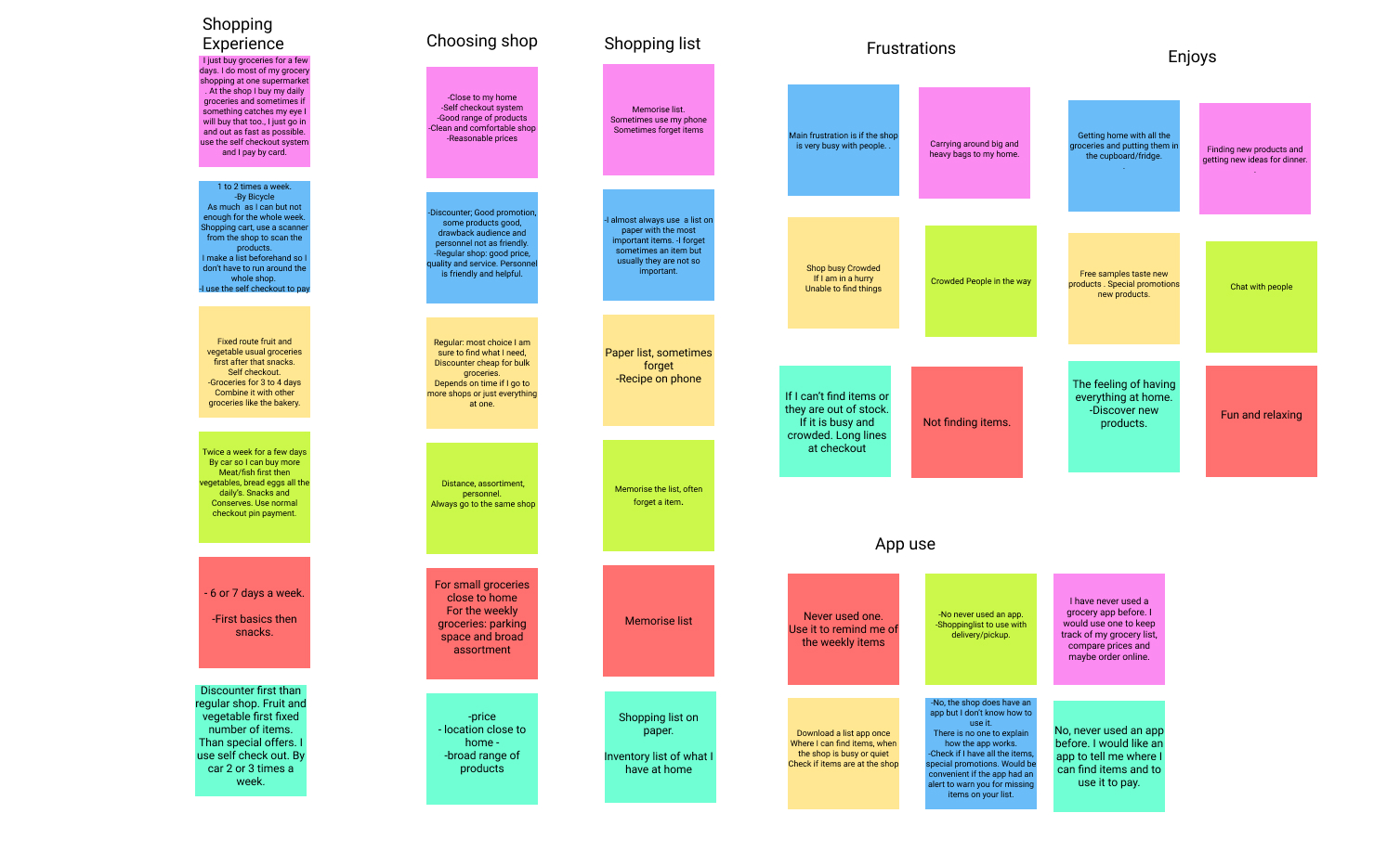
I organized all the findings from the interviews in an affintity diagram to organize the data and to find common themes and make clusters of common themes.
Most participants said they would like to use an app to keep track of their shopping list. One participant also mentioned she has an inventory list of all the items she already has at home. I think that could be a very useful feature and easy to combine with a shopping list app.
Many Participants also expressed their frustration when they could not find a product or if it was out of stock. As an extra feature the app could also display if a product is in stock and where to find it.
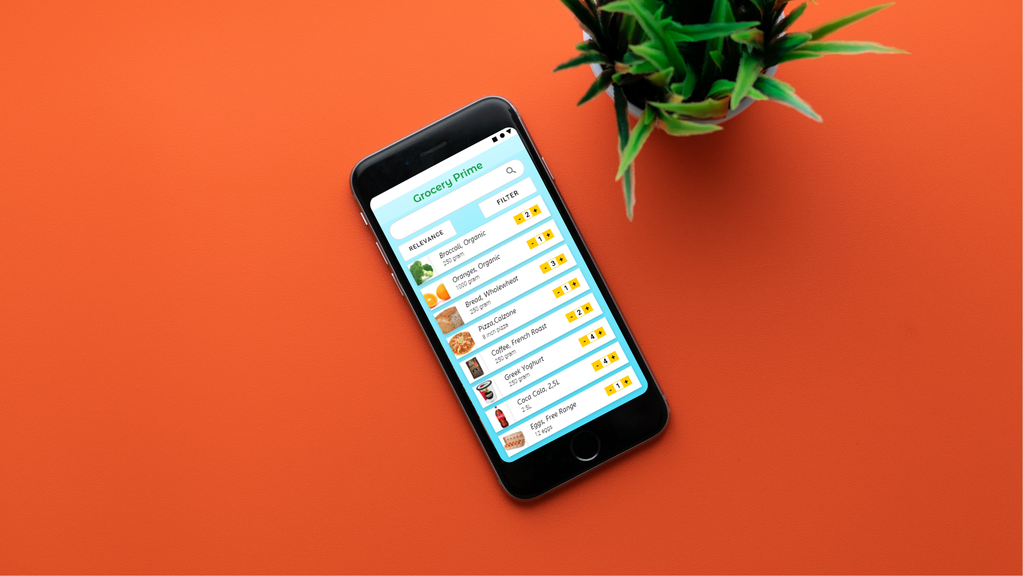
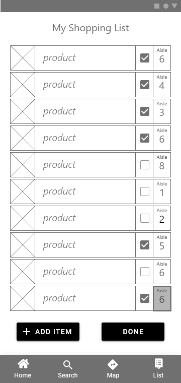
My solution is an app that doubles as a shopping list- and location tracker. Users will be able to fill in a list to track their items. The list will not only display the items but also display the aisle number where they can be found. When the user presses the aisle number on the list a map will pop up that shows the location of the item.
Affinity Diagram
Sketches
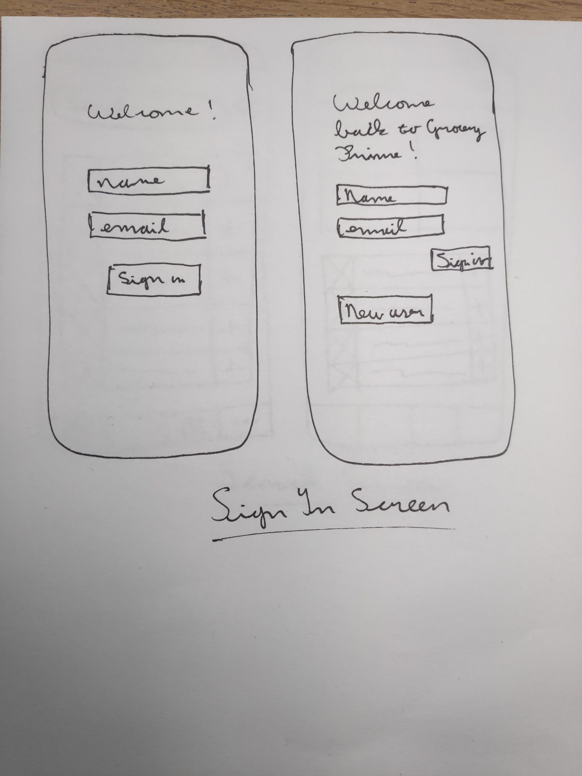
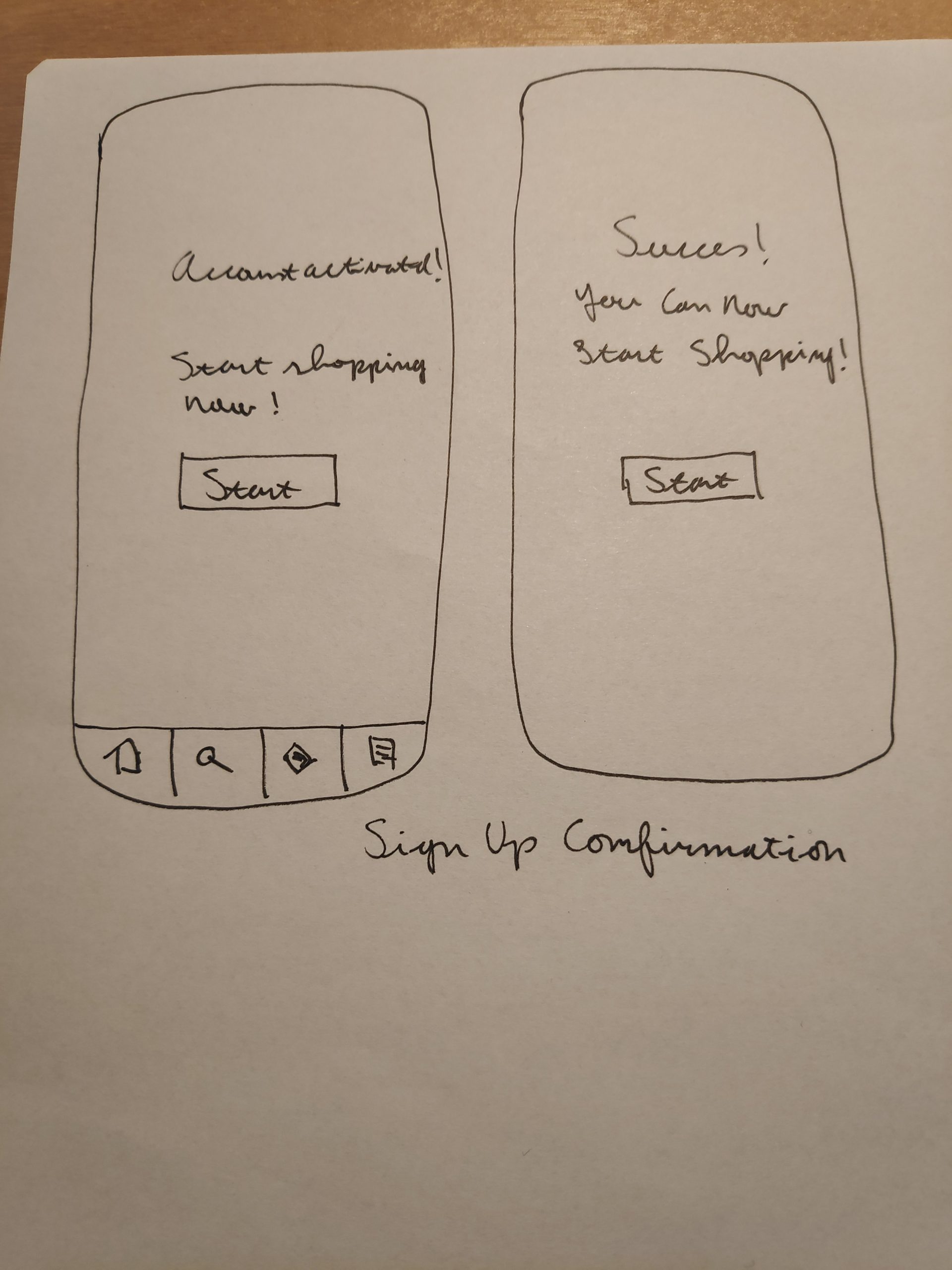
Before I started sketching I thought about what main steps the user would have to follow to complete the task. I decided on five steps the user would encounter when using the app. I sketched two versions of each screen.
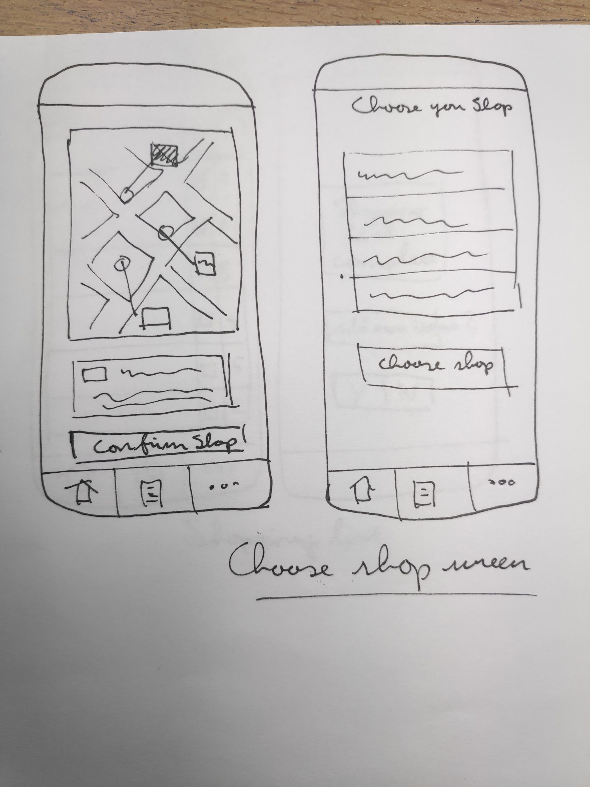
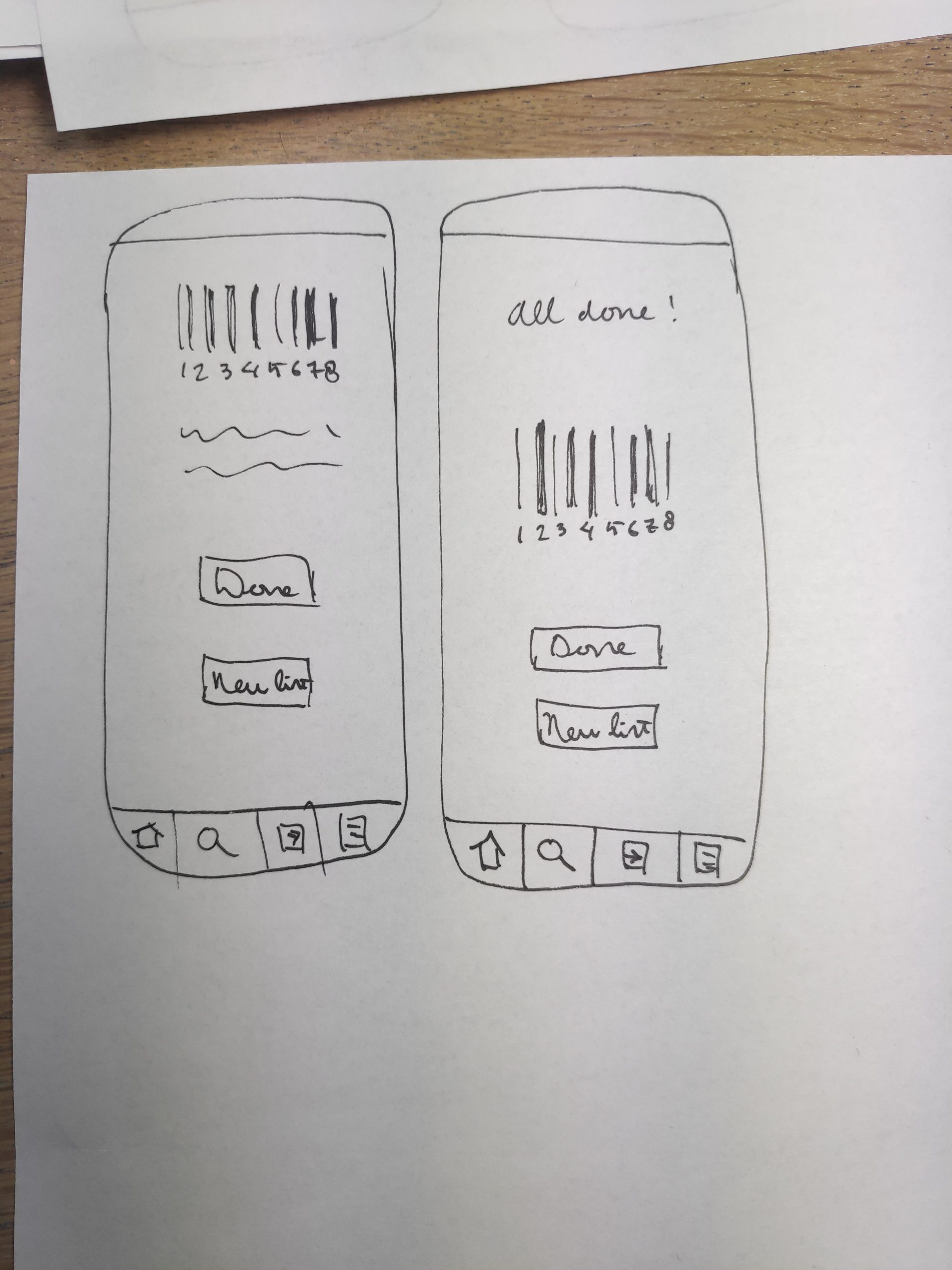
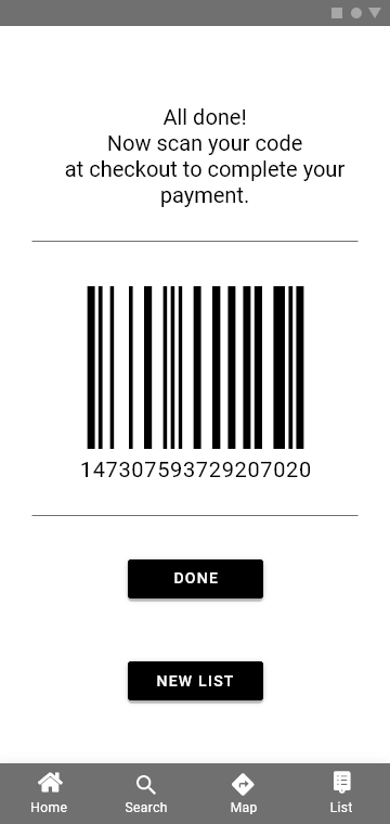
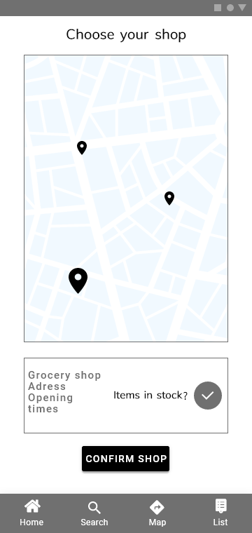
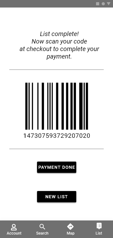
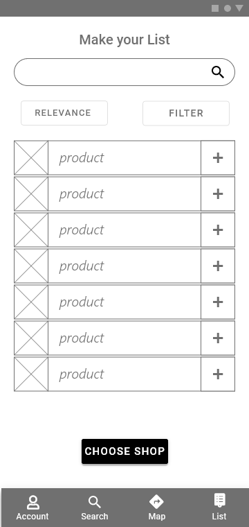
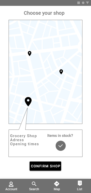
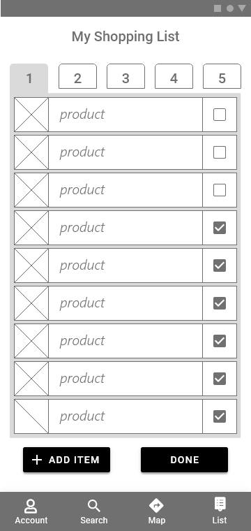
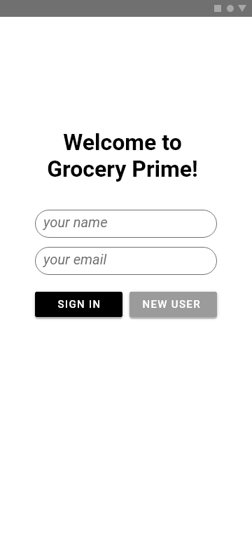
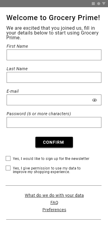
1 Sign in The user logins in to the app. 2 Make List and Confirm The user fills in all the items needed. 3 Choose Shop After the user has completed the list, the app will display shops in the vicinity of the user and which shops have all of the items. 4 Mark Items After the user has chosen a shop the app will display a shopping list and a map which the user can use to track their shopping. 5 Checkout When the list is completed the app will show a barcode that can be used to check out the items at a self checkout station.
Sign Up Screen
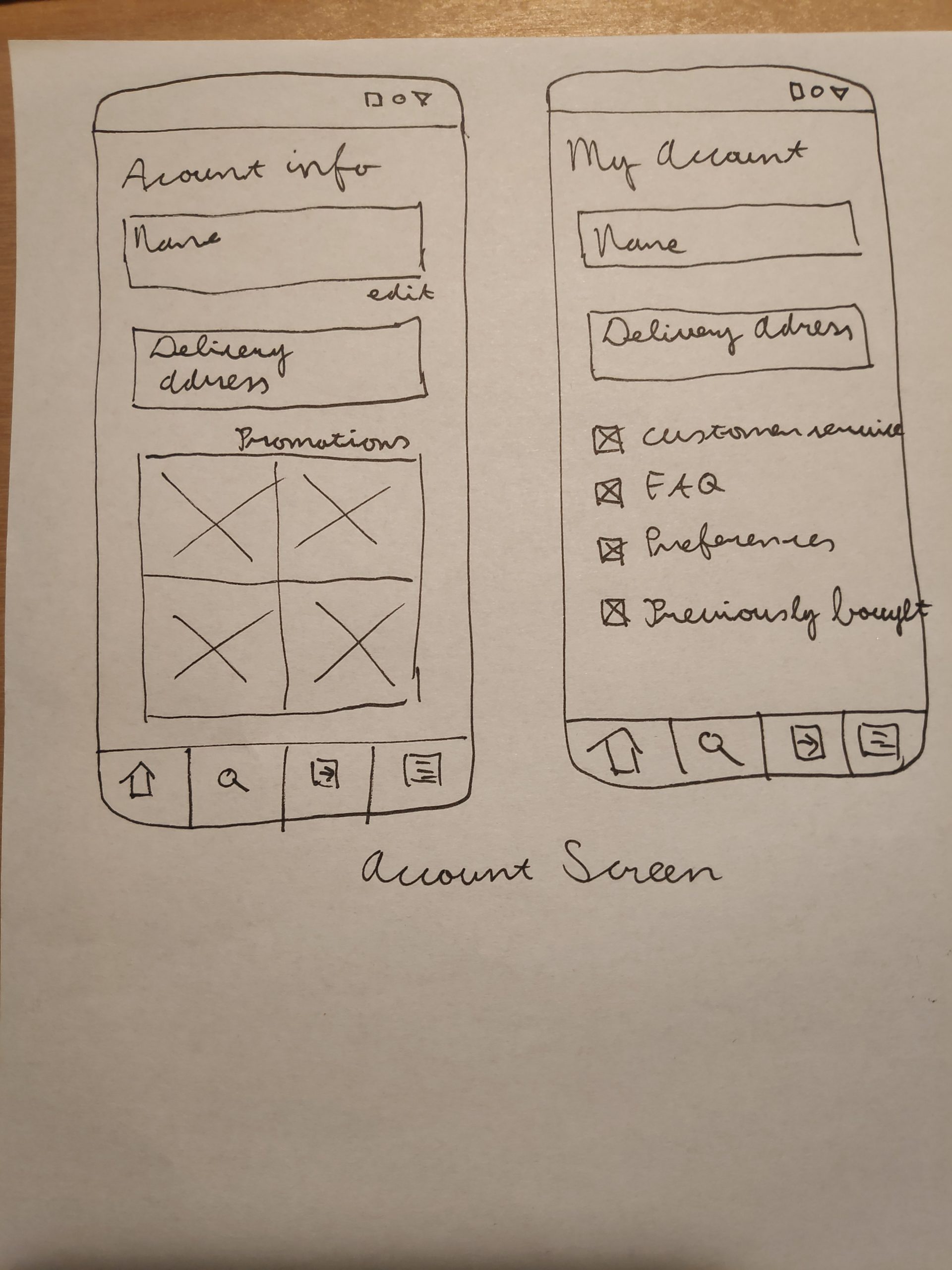
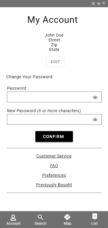
Account Screen
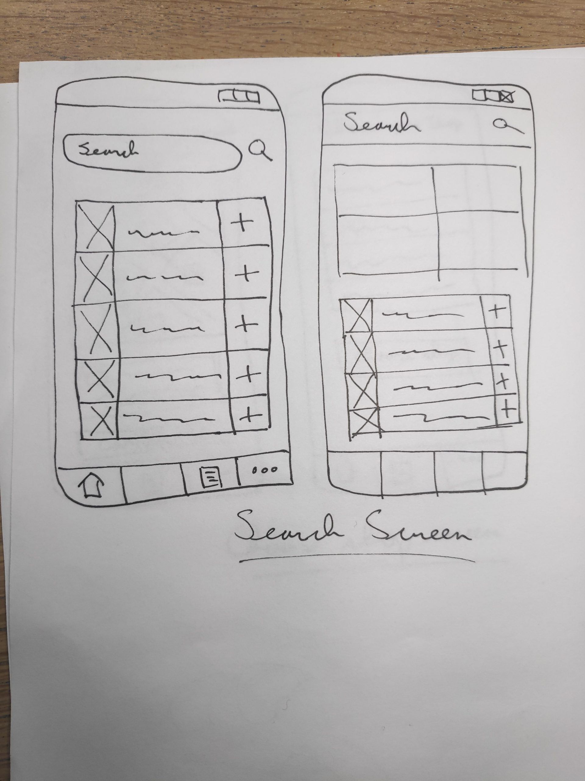
Search Screen
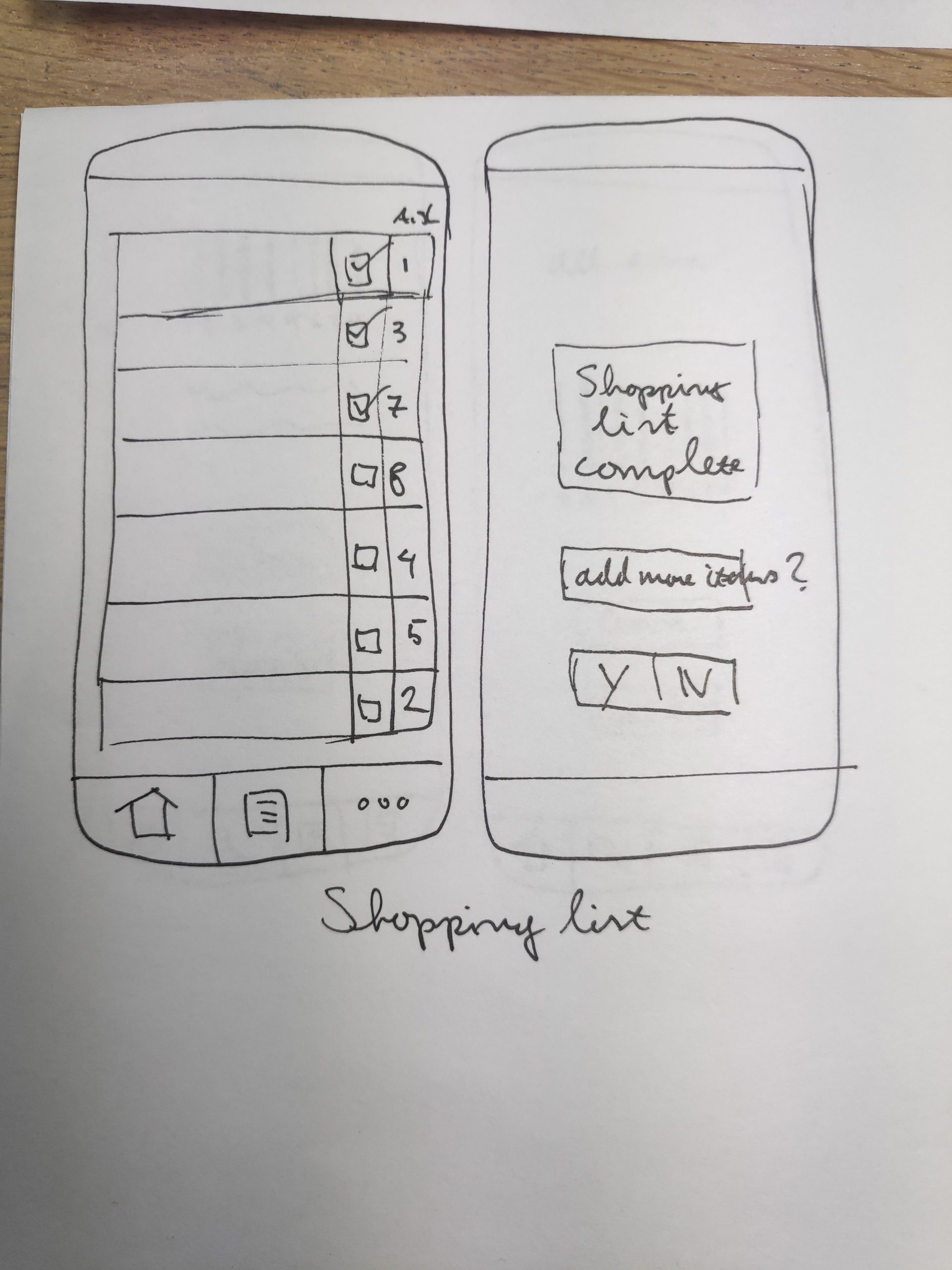
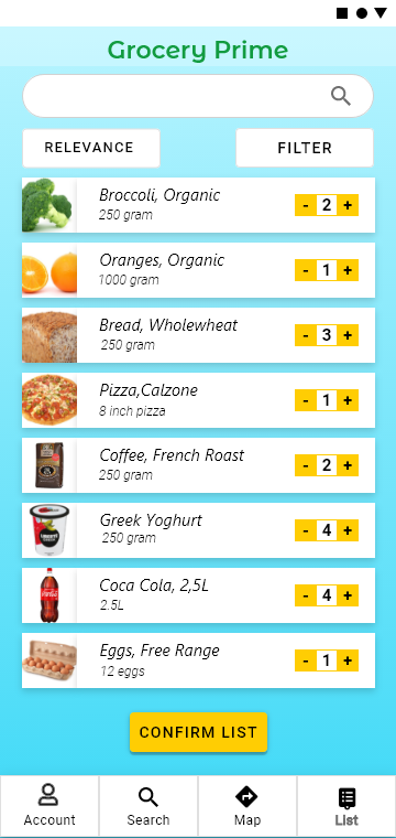
Shopping List Screen
Choose Shop
Map Screen
Check Out
Wireframes and Prototyping
After completing the sketches I ideated on the screens and designed the wireframes. The wireframes were used as the basis for a working protoype of the Grocery Prime app.
Check Out Screen
Choose Shop Screen
Shopping List Screen
Sign Up Scrteen
Map Screen
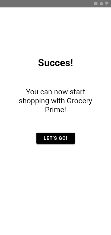
Confirmation Screen
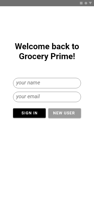
Sign In Screen
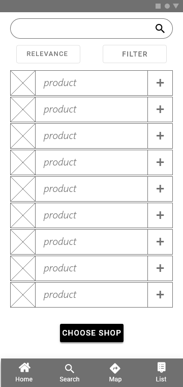
Search Screen
User Testing
With the first version of the prototype I conducted user testing. Like the interviews I did some of the testing online. I used screen sharing software so I could see the cursor movemnents participants made. I instructed the participants to voice all the thoughts and impressions they had during the testing so I could get a clear idea about their thought process and impressions during the test.
What went well?
Most participants had no problem navigating through the app. Several participants appreciated that they were not automatically set up for email newsletters and liked that there was information on how their data is used. Most participants understood how to make a shopping list and find a shop. All participants liked the shop map feature and found it very useful. The checkout page was for most participants self explanatory and clear. Overall participants thought it was a useful app that they could see themselves using in a real life situation.
What needs to change?
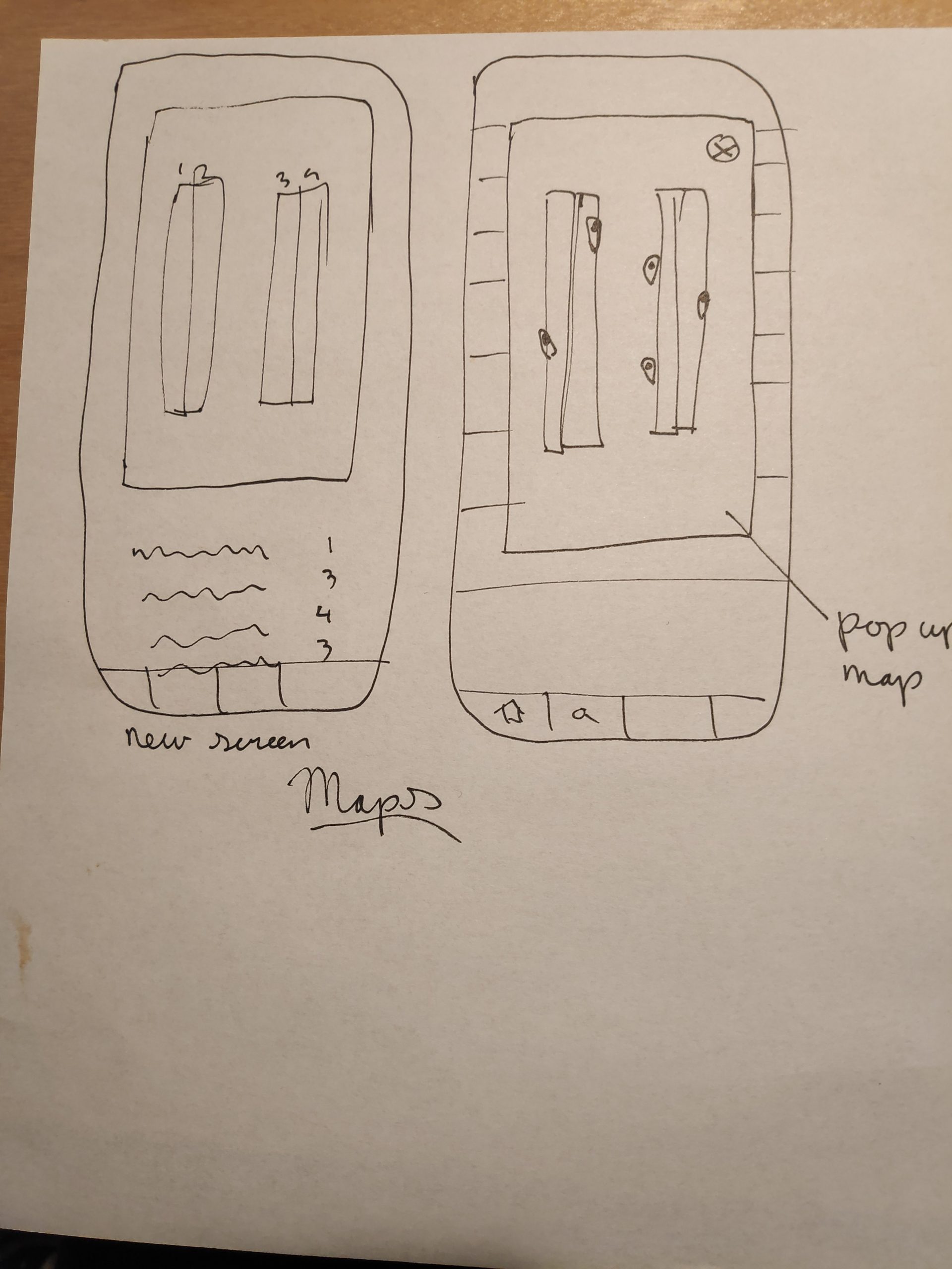
For several participants it was not immediately clear how to make a shopping list. One thought it was a stock list, others struggled to figure out how to add items to the list. Several participants also missed a way to make more than one list in the app. Some found the voice of the app a little bit too informal and distracting. They would like it to be a bit more professional and to the point. Most participants also pointed out that although the map is a useful feature they had trouble orienting themselves on the map.
Updated Prototype
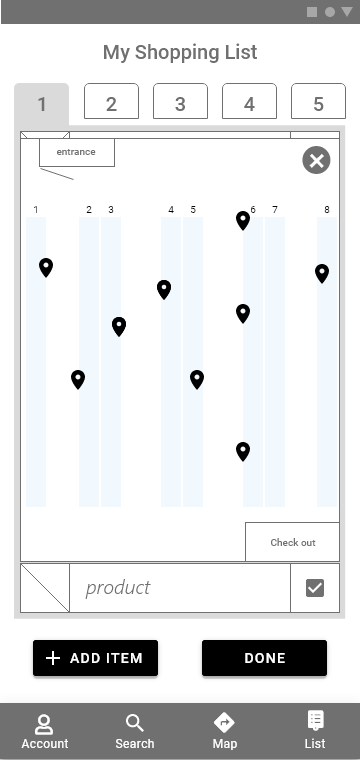
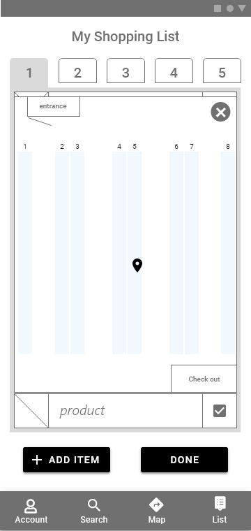
I clarified the purpose of each page, especially the compile list page. On the choose shop page I made the selected shop icon bigger and added a pointer to the location. To make it easier for users to orientate on the map I added more context like the entrance and checkout locations. I also organised the shopping list in aisles. I made seperate tabs for each aisle so the user can shop all the items aisle by aisle.
I had a lot of fun with this project, designing an app was a first for me. Designing an app is comparable to designing a site as you present information in pages, however the challenge in designing an app is in creating a logical user flow.
During the project I was struggling to design a logical userflow. So I created a user flow chart. This helped me to understand which actions a user has to make when using the app and I had a clear overview of the whole process seeing where problems arose and how I could guide the user through the whole process.
This project was also the first for me in using a design system, for the project I used Google’s Material Design as I myself am an Android user I thought it would be a good idea to use a system with which I am familiar.
Before this project I had very limited experience with Adobe XD, I used Figma mostly. During this project I gained a much better understanding of XD and I have set a goal for myself to use it more often. I like that the interface feels a little bit more intuitive than Figma.