Shirts By Mike

Casestudy 1

Shirts By Mike

Picture of a laptop with mock up website

Overview

This was the first project I completed for the Treehouse Techdegree program.  This casestudy centered around the shirts by mike website, an e-commerce website selling T-shirts. I was tasked with the complete redesign of the site, updating the visual design and solving major functionality issues.  I started with defining the major problems of the site. After that I created a user persona, an empathy map and a journey map. From here I went on to create sketches, wireframes and eventually fully rendered mock ups.

Problem

The stakeholders felt that the existing site was dated and its content was stale. Also, it was lacking some functionalities compared to their competitors. They felt the current design held back growth and sales, and that a redesign would attract new customers and boost sales.

Site Analysis

Strengths

  • The website is very clear and easy to navigate. With one click you can choose a T-shirt and you can easily navigate back by hitting the logo button.
  • The website uses colors well to draw the user to the major sections, like the orange header and footer. The use of grey connects the elements together and gives a uniform feel.
  • The use of Mike the frog gives the site a playful vibe and personality. It is not some random T-shirt shop, the visitor can connect  to Mike.

Weaknesses

  • The Hero page does not add much to the site at the moment. I think it should feature the T-shirt of the month together with a call to action button to buy the shirt.
  • The visual design could be improved with more playful fonts and buttons.  Also different textures for the background colors would make the site visually more appealing.
  • The site is very sparse on  information about the company, contact details, delivery options, return policy etc. Adding an about page and contact form would increase shoppers confidence.

Summary

The basic functionality of the site works well, however the shopping cart section should be added and the buy now buttons activated. Also features like a shipping estimate, a fitting guide and currency converter would increase shoppers confidence and increase sales.

The redesign of the site should focus on the visual design elements. The hero page can be utilized to feature a monthly T-shirt or other promotional activities. More modern and playful fonts and UI elements would help to target a younger demographic and boost sales.

Audience

The target audience consists of mainly Treehouse students. Most students are aged between 16-35 years old, primarily living in the United States. Treehouse students are lifelong learners, they value community and have a playful attitude.

With the information given I created a user persona of William, a 28 year old web developer from the US. While writing the user persona I thought about William’s goals and needs and what possible frustrations could be.

Next, I created  a journey map to uncover pain points and delights which William could experience while browsing the website and ordering a T-Shirt.

Solution

Redesign

Before I started designing I formulated three main design goals for the site:

It should not take much effort to make a purchase, ideally no more than three clicks should be enough.

The user should be able to access any page from the site from anywhere.

The site should use a recognizable layout throughout.

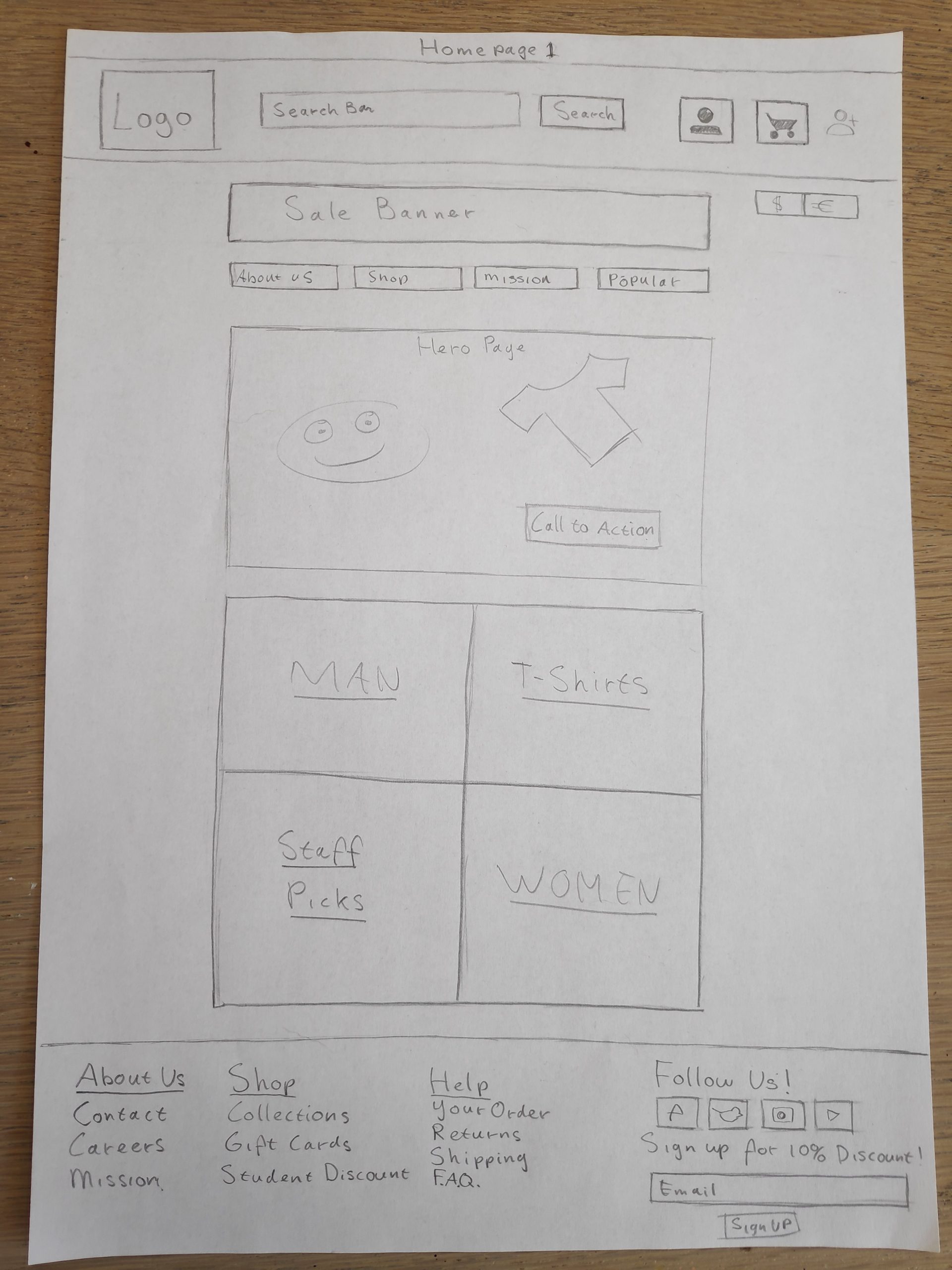
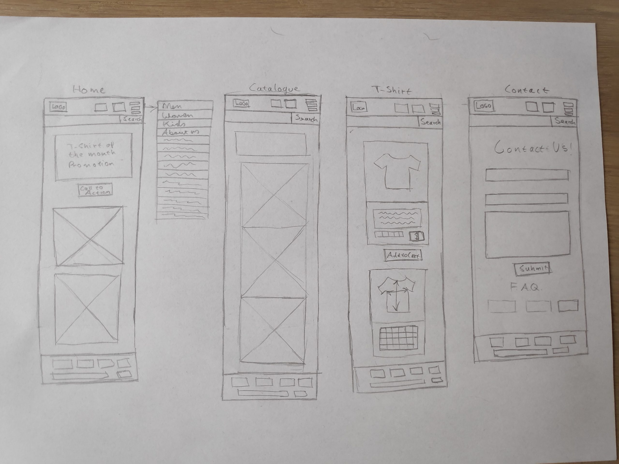
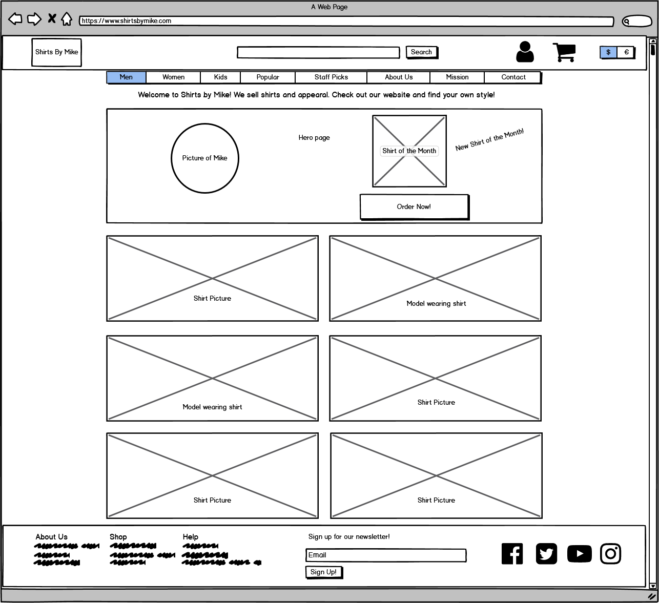
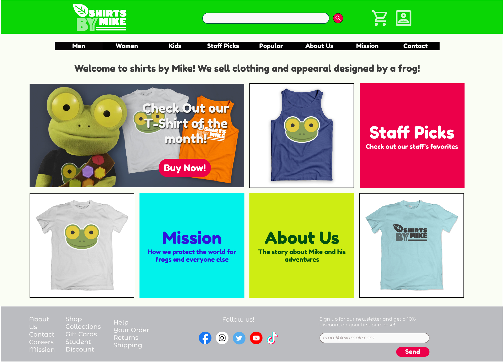
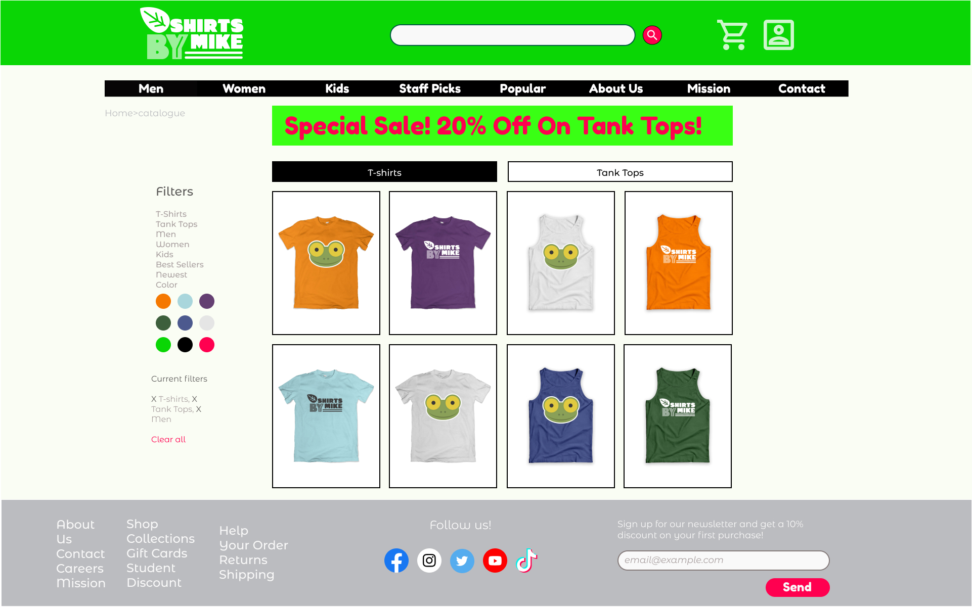
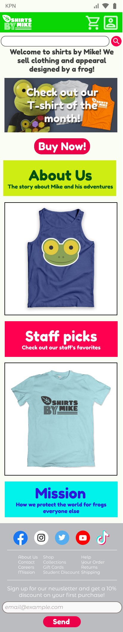
I divided the site in three sections, the header, the main body and the footer. I chose to keep the header and footer mostly the same throughout the site to keep a recognizable and predictable experience for the user, 

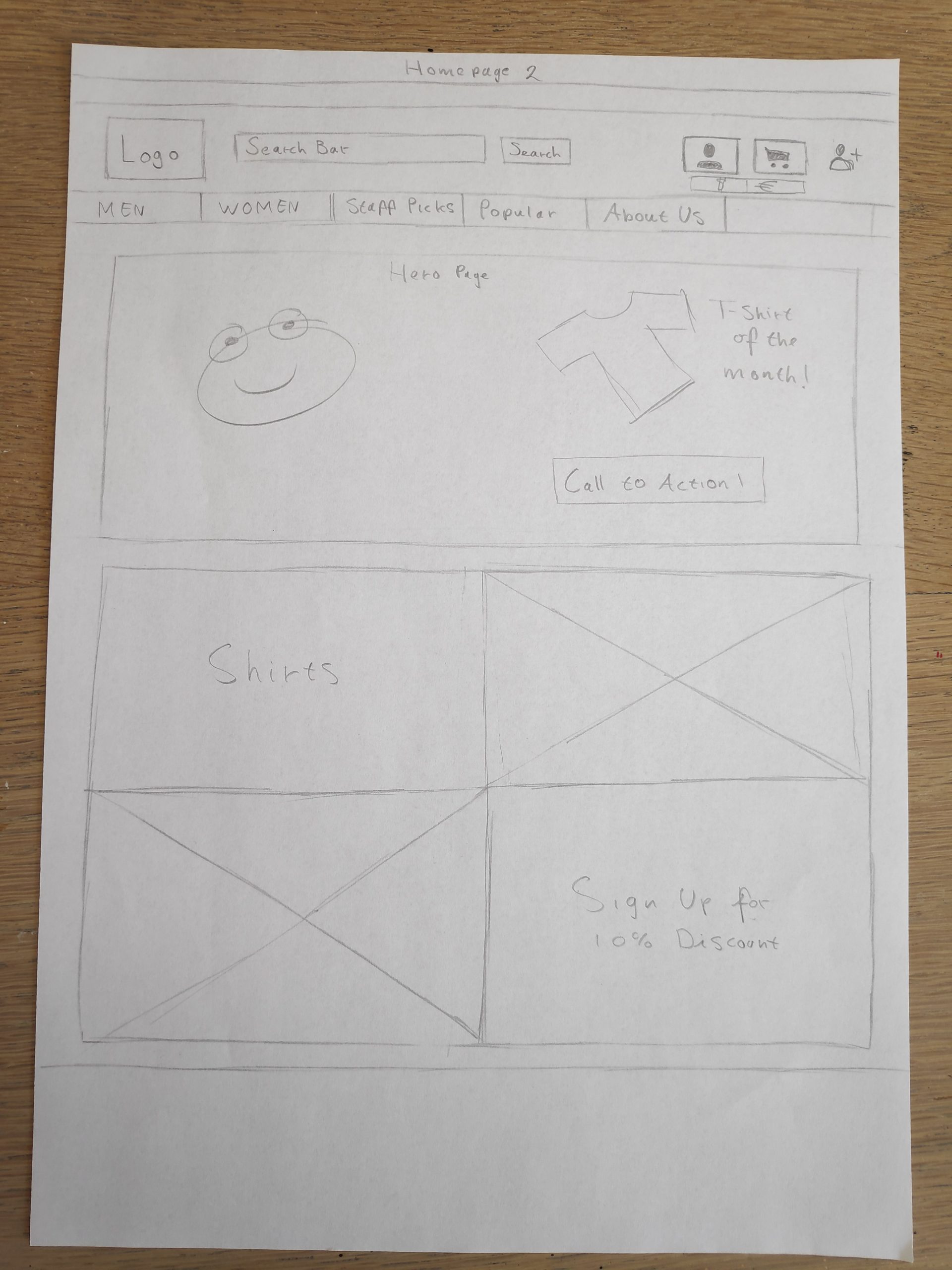
I started with the header. I put the search bar in the middle as I think that users will want to be able to do search quickly. I started thinking about what elements the user will want to access quickly.  I tried out a few ideas for placing elements in the header. In the first version I placed a lot of elements in the header but it became too crowded so I moved the currency button to the outside as I think this is a secondary element.

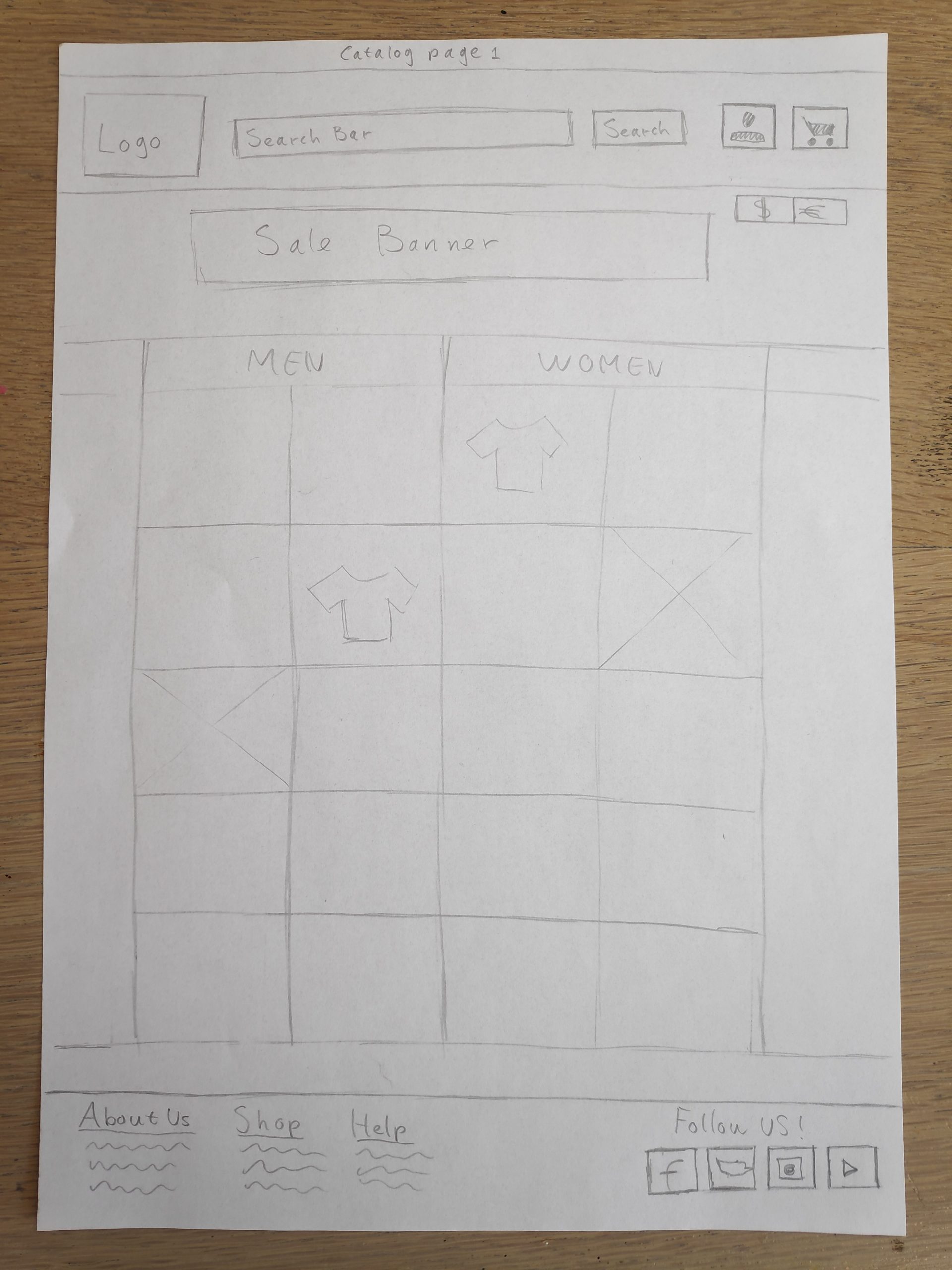
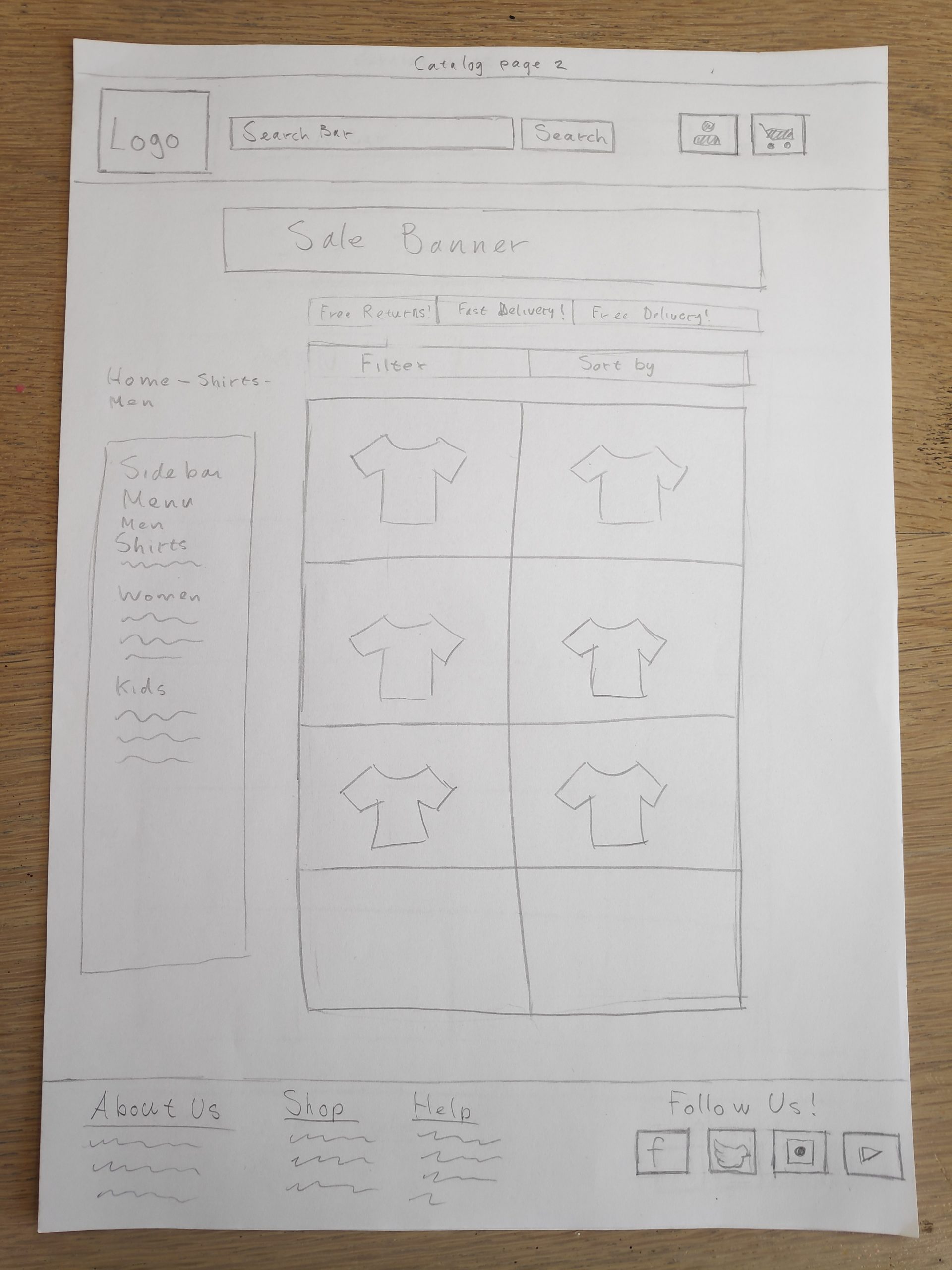
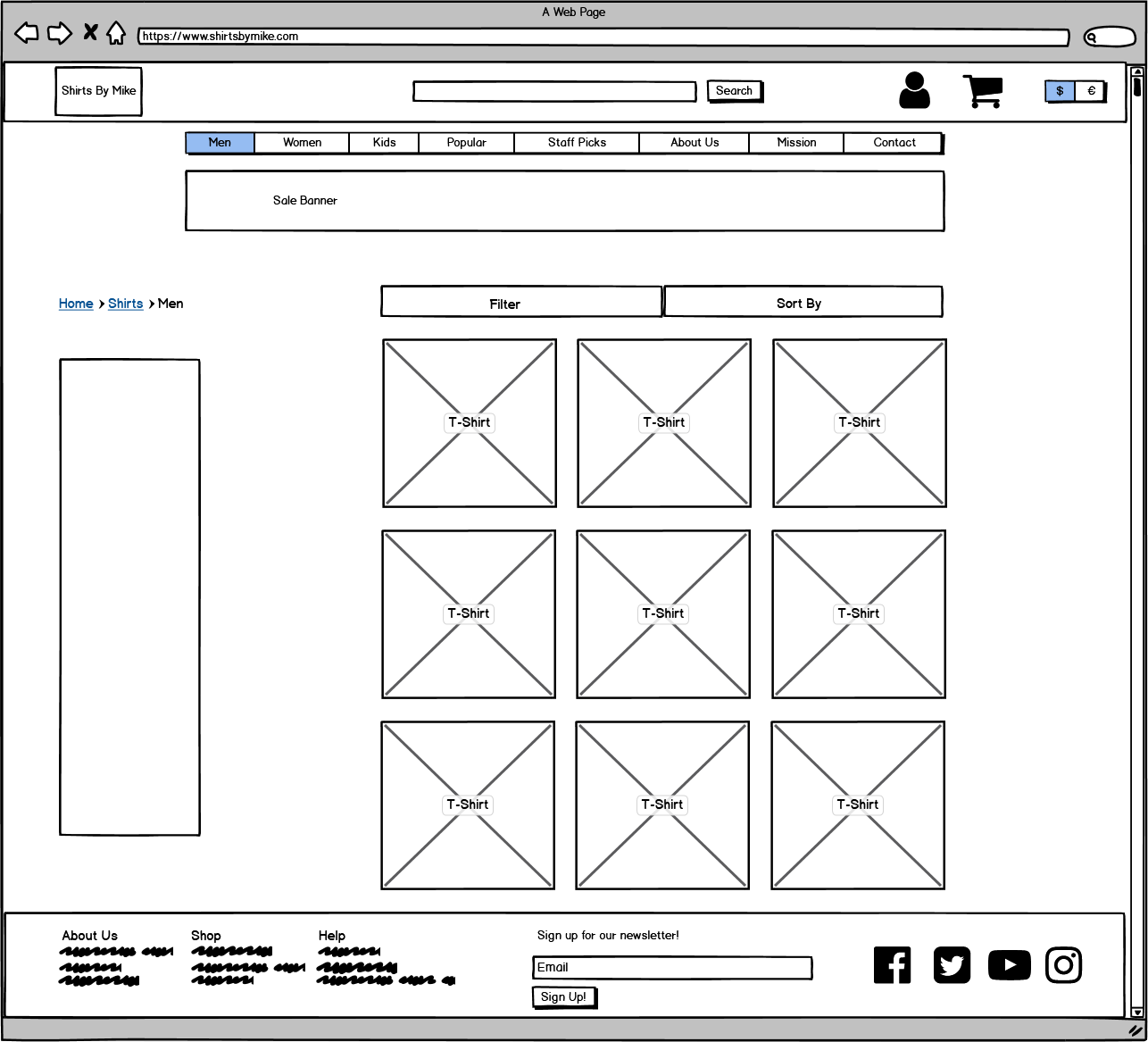
In the first version I placed the navigation buttons floating under a sale banner. However I noticed in the sketch that the buttons  ‘disappeared’ between the sale banner and main content. Therefore in the second version I placed the buttons in the bottom of the header this is much more clear and logical.

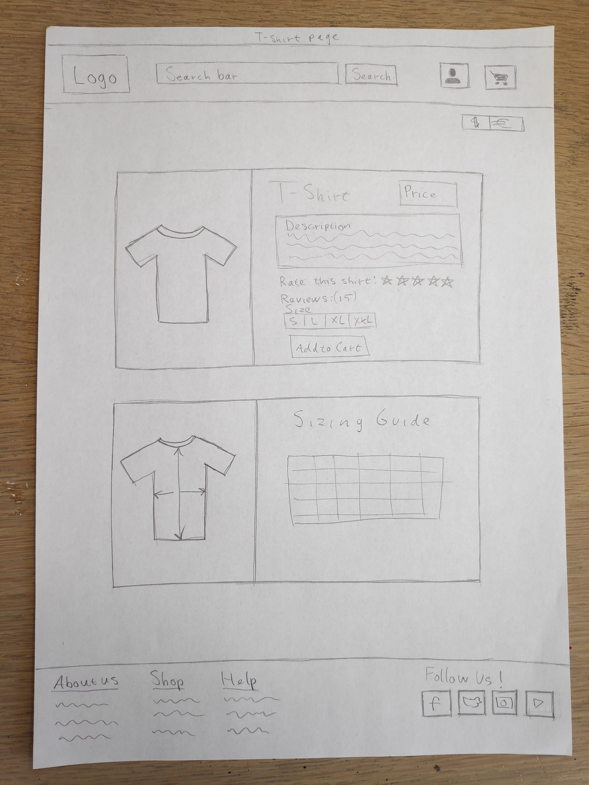
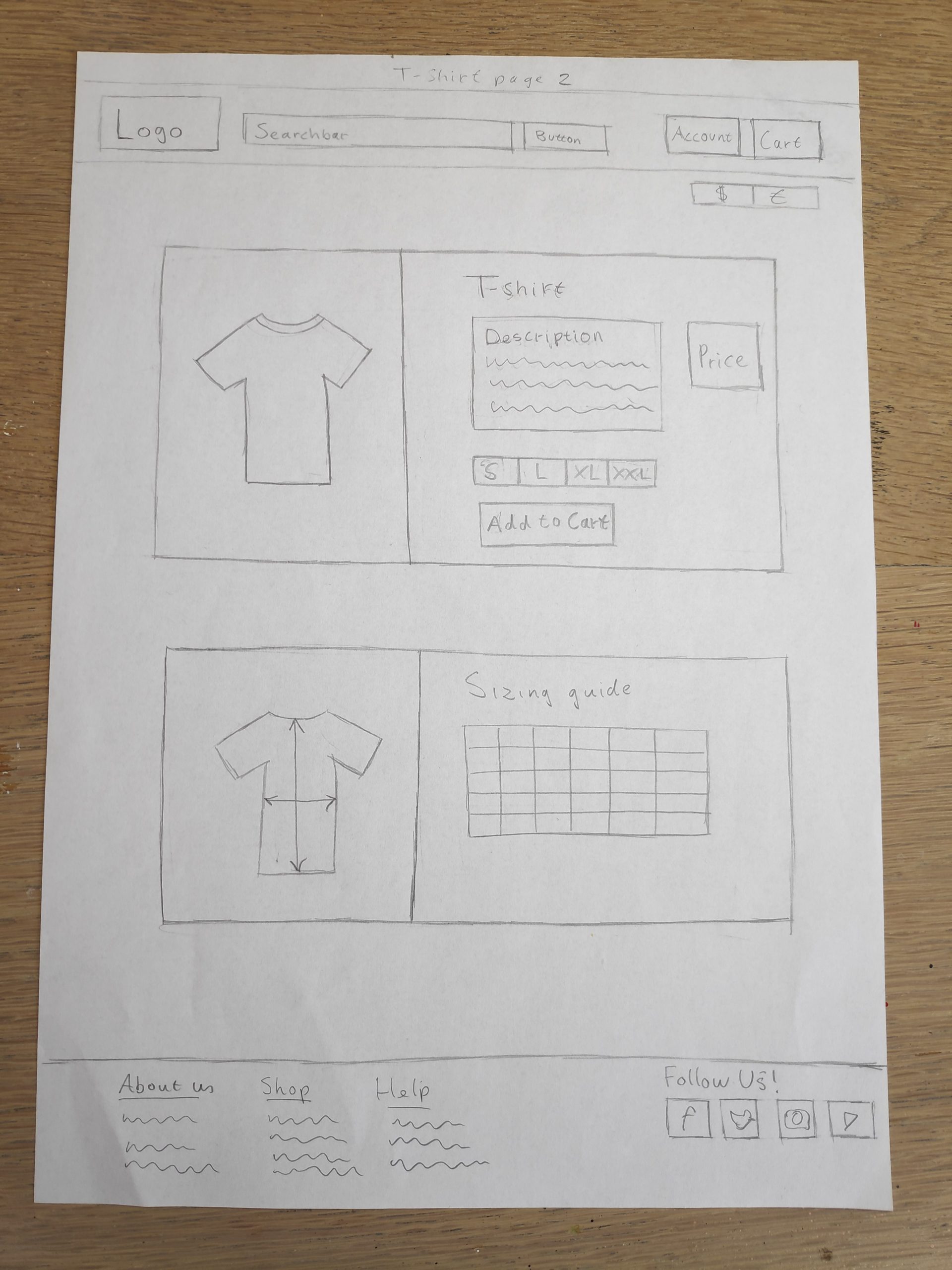
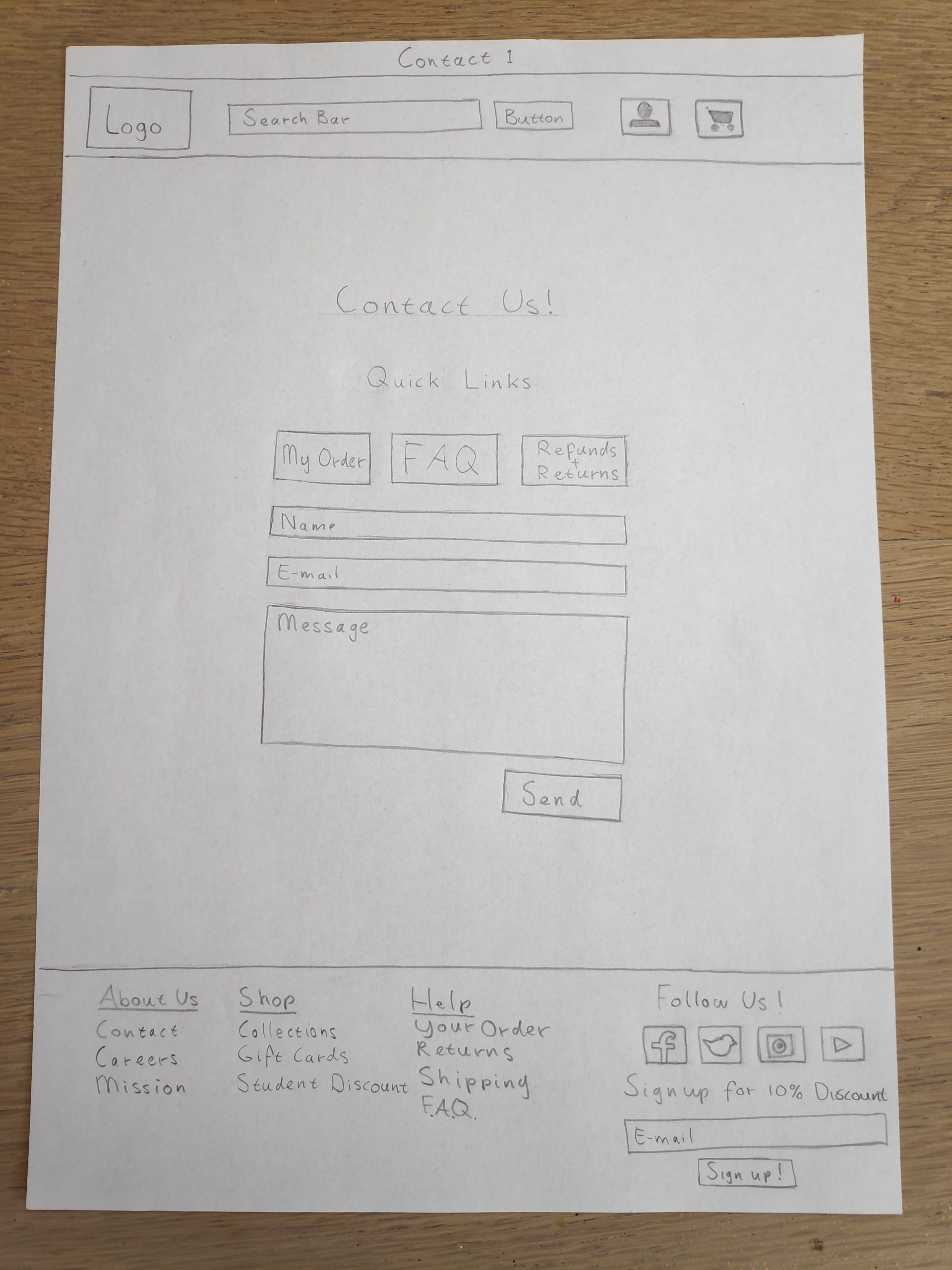
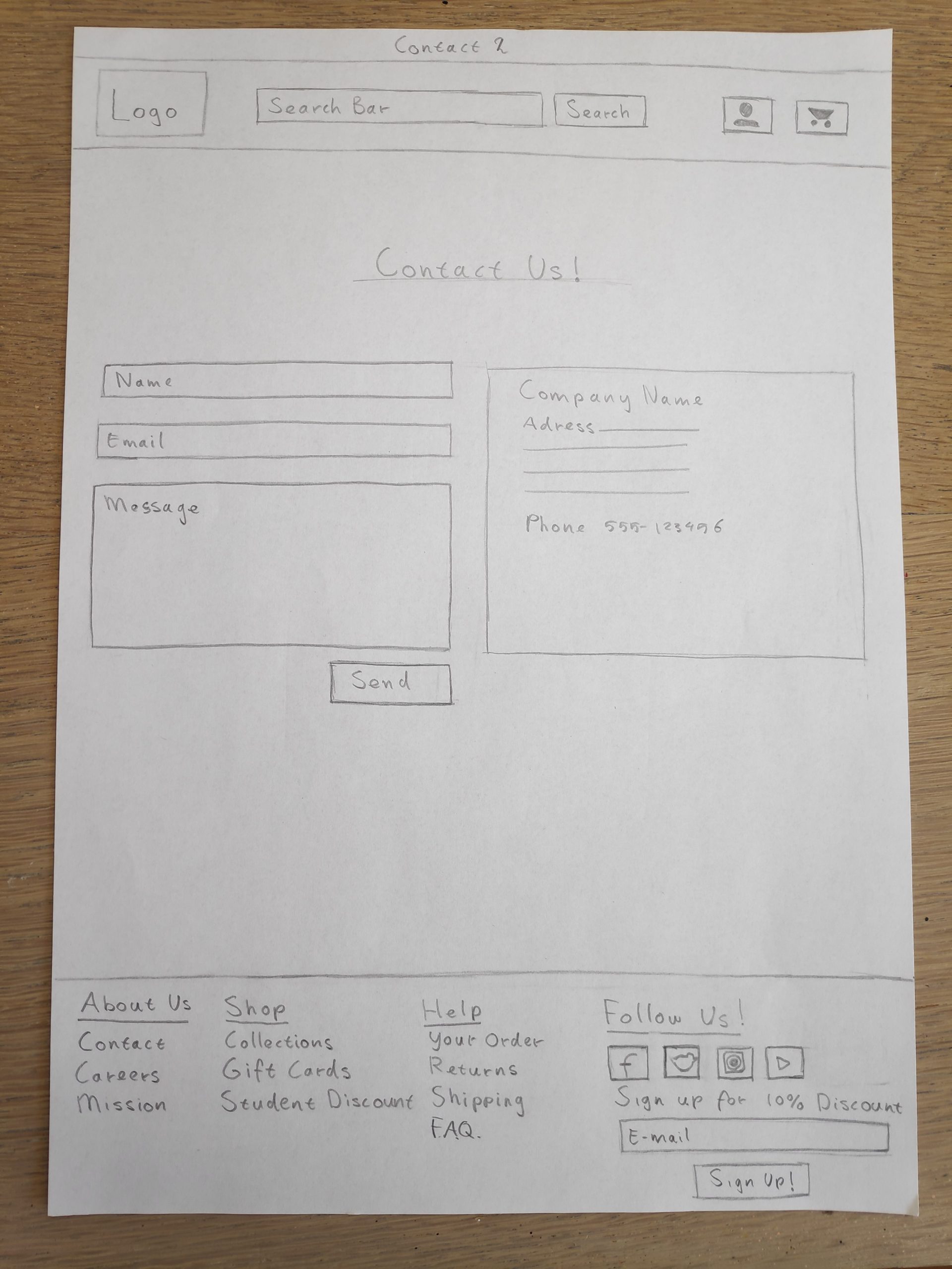
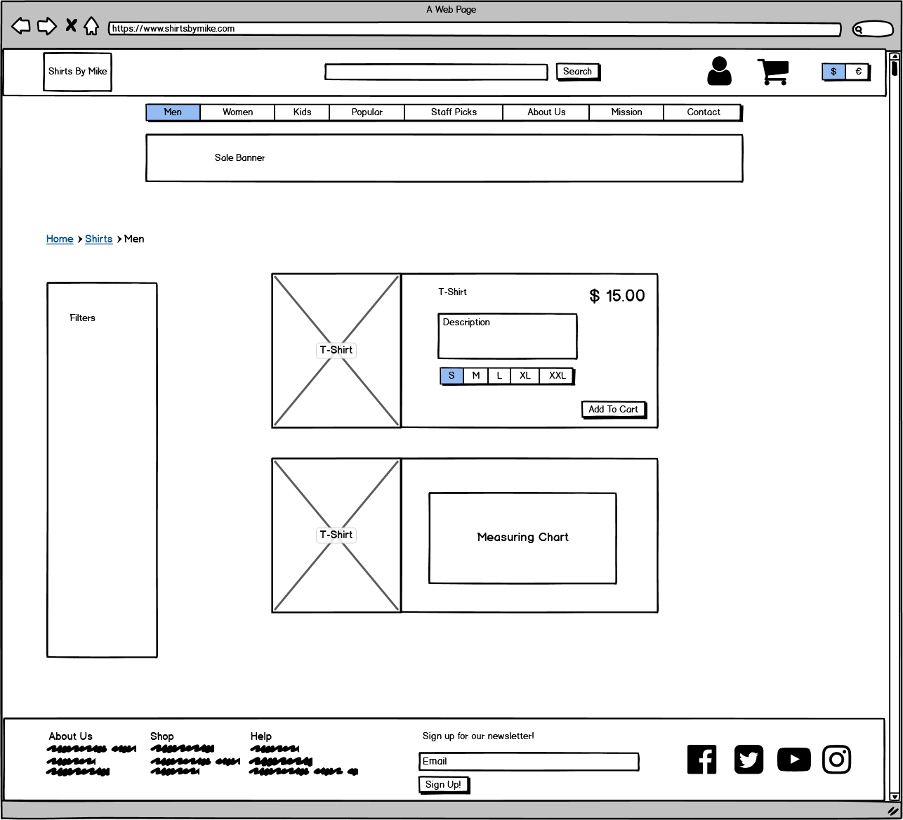
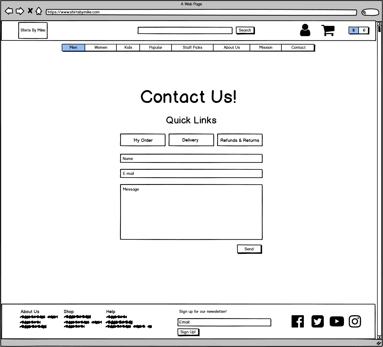
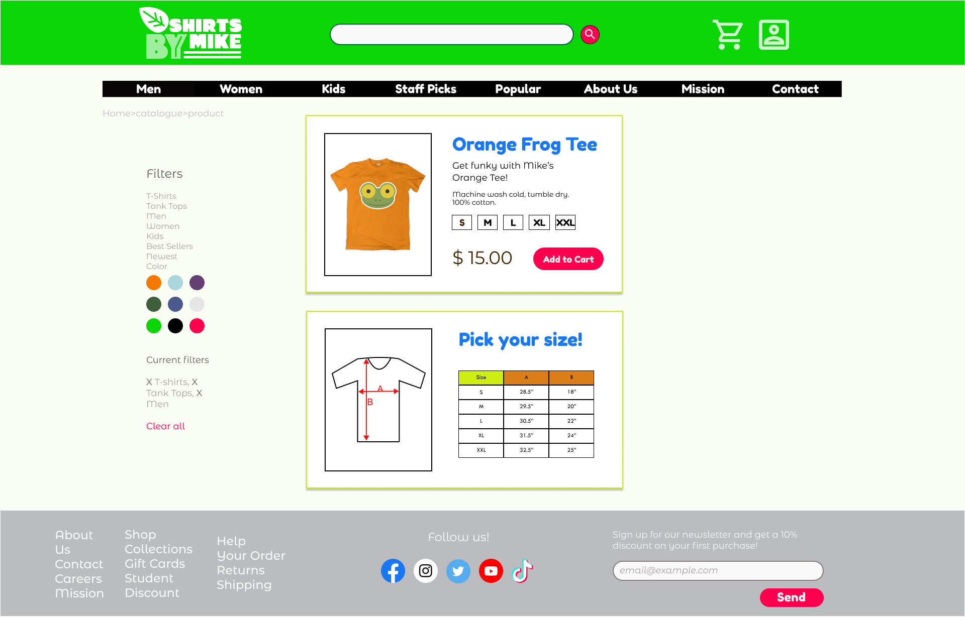
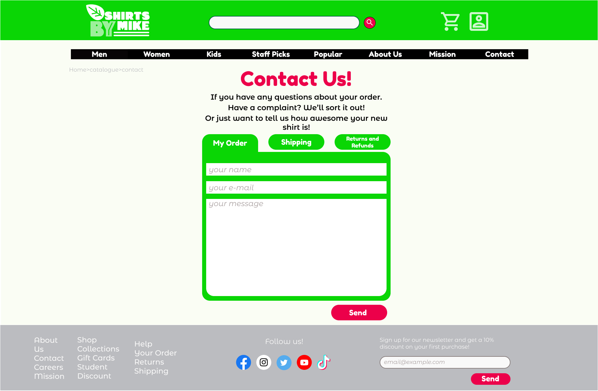
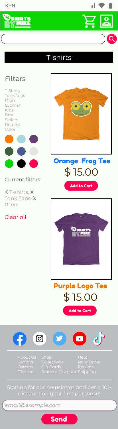
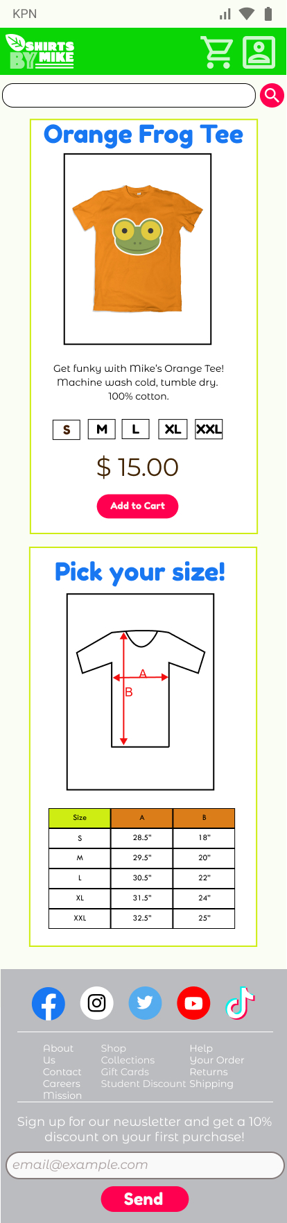
The main section holds the site content such as the landing page, catalogue with merchandise, contact information and the shirt page.

For the main section I tried different approaches. I decided to place the most important content in the center of the page right in view of the user, this will also make it easier to convert the site to mobile. However for the catalogue page I deviated from this with the shirt grid centered there was not a lot of room to add a filter tree on the side so I placed the grid slightly off center adding space for the filtertree.

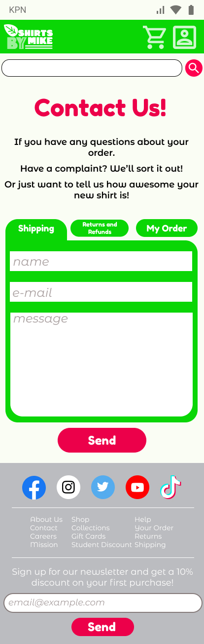
For the footer I thought about what exactly is its function? I view the footer as kind of a reverse header, it contains information and links you don’t immediately need for the site to function but adds some extra level of depth.  Initially I kept the footer simple and straightforward with just some links and. Later I decided to add an email newsletter form and also added some social media buttons.

Wireframes

I used Balsamiq to design the wireframes. Working on an editor immediately showed me how much more space I actually had for the site. During sketching I tended to keep the available space small. Using this extra space I was able to add some more elements and group them accordingly.

In the header I added the currency button which in a previous iteration I had placed outside. During sketching I envisioned the navigation bar spanning the whole screen but during wireframing it became clear that I would not need this much space, so I grouped the navigation bar into one element that floats just below the Header and I centered and aligned it with the main content.

I redesigned the Footer in the same way. In the previous iterations I placed the newsletter form below the Social Media buttons but now I placed it in the middle of the footer.

Color Redesign

For the redesign I decided on complementary color contrast consisting of Green and Red. I used bright and saturated colors for buttons, headers and banners.

For the main parts (header, background and footer) I used slightly subdued colors to keep the overall look of the site balanced.  

I used green for the header. For me it was an obvious choice as Mike is a green frog that this should be the main theme. For the buttons I used a bright and saturated red, signaling to the user that something happens when you press it.  

To balance the busy colors I used grey for the footer, it is mostly a recap of the site containing all the basic information so it makes sense to keep it neutral and I don’t want the user to get distracted too much by the footer.


Typography

For the headings I chose Fredoka One because it has a  friendly and playful feel. It has a high x-height making it suitable for headings and also has a low stroke contrast. All the edges are rounded giving it a soft and friendly look.

For the body text I searched for a font that would compliment Fredoka One but would set the body text apart from the headers. I chose Montserrat Alternates, I like that it is rounded like Fredoka One and has a similar x-height which helps to keep it readable at small sizes. Also the “e” crossbar is angled giving it a playful look. It differs in that It has a higher stroke contrast than Fredoka One which sets it clearly apart and  also helps readability at a smaller point size.

Desktop Mock Ups

When thinking about the redesign I had a few goals in mind: Appeal to a younger audience, increase the users’ emotional bond with the site and add more functionality.

I wanted to immediately make a connection with the user when he/she visits the site. So, I placed an introduction text about Mike the frog at the top of the homepage welcoming the user. I also expanded the landing page with promotions, links to the mission statement, about us page and staff picks.  

I found the old site lacking in functionality which in my view would not instill much confidence or help build an emotional bond with the user. So, I added more functionalities like a search bar in the header, a contact page and search filters for the catalogue page.  

I expanded the footer with links to all relevant pages on the site. I also added social media buttons and an email sign up form.

Mobile Mock Ups

First thing I changed was the layout of the content, with a narrow screen of a mobile phone there is a lot less space so it makes sense to simplify the content to the most important functions. I outlined the main content in the center of the site, placing all elements under each other. This is an effective way to make use of the scrolling space of a mobile site.

On the catalogue page I diverted from this approach, outlining the filters in the center proved to be tricky so I kept the filters outlined on the left and made a one column grid for the catalogue on the right.

The search bar would, at this size, not have enough space to be useful so I moved it from the header and placed it right under it.

I made the buy now, add to cart and send buttons all a little bigger to make them easier to use on a touchscreen.

Learnings

For me the main part of this project was learning how to make a high-fidelity mockup using a prototype program like Figma. It was a steep learning curve as I don’t have much experience using graphic programs. However, I enjoyed seeing my ideas come to life on the screen. I also now have a much deeper understanding of design principles and how it impacts the design process. Lastly, I now know how to use fonts and types effectively on a webpage, learning all about baselines, kerning, x-heights and so much more!