For the next project I was taskedwithdesigningtwo userflowsforan email marketing campaign website calledWhooshMail. The twoflowswill walk throughthesamescreens, but withtwo different user roles. The first role will be called “Admin” and will have thehighest level of access whilethe second role, “Basic”, will only have access to a few features.
WhooshMail is lookingtoimprovetheexperienceforboth of these roleswiththeiraudience of small business ownersand entrepreneurs.
Problem
Wooshmail aimes to provide an easy-to-use email marketing system for small business owners to help them keep costs low. Wooshmails wants to help increase the number of jobs here in the U.S. and that starts with small businesses. However Wooshmail identifies the following problems with their email service:
The process can be clunky and confusing
There are a lot of competitors so we need to stay competitive and have similar features
What features are accessible to each user role can be confusing
Through improving the experience for their main user roles (admin and basic), Wooshmail likes to see an increase in user retention and also the number of campaigns sent.
Audience
Wooshmail provided me with the following profiles on the target audience.
Admins: Mostly ages 40-60 Primarily based in the United States Small business owners High School/GED or Bachelor’s Degree Ready to be their own boss Pursuing their passions Used their personal funds to get started
Basic: Mostly ages 20-40 Primarily based in the United States Work for a small business High School/GED
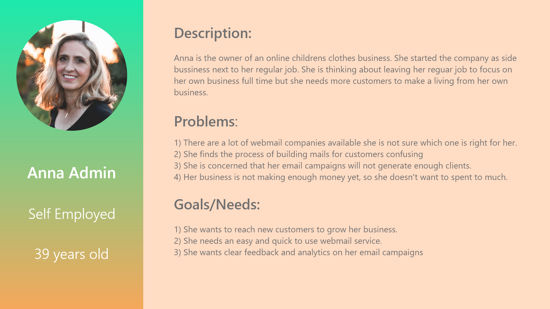
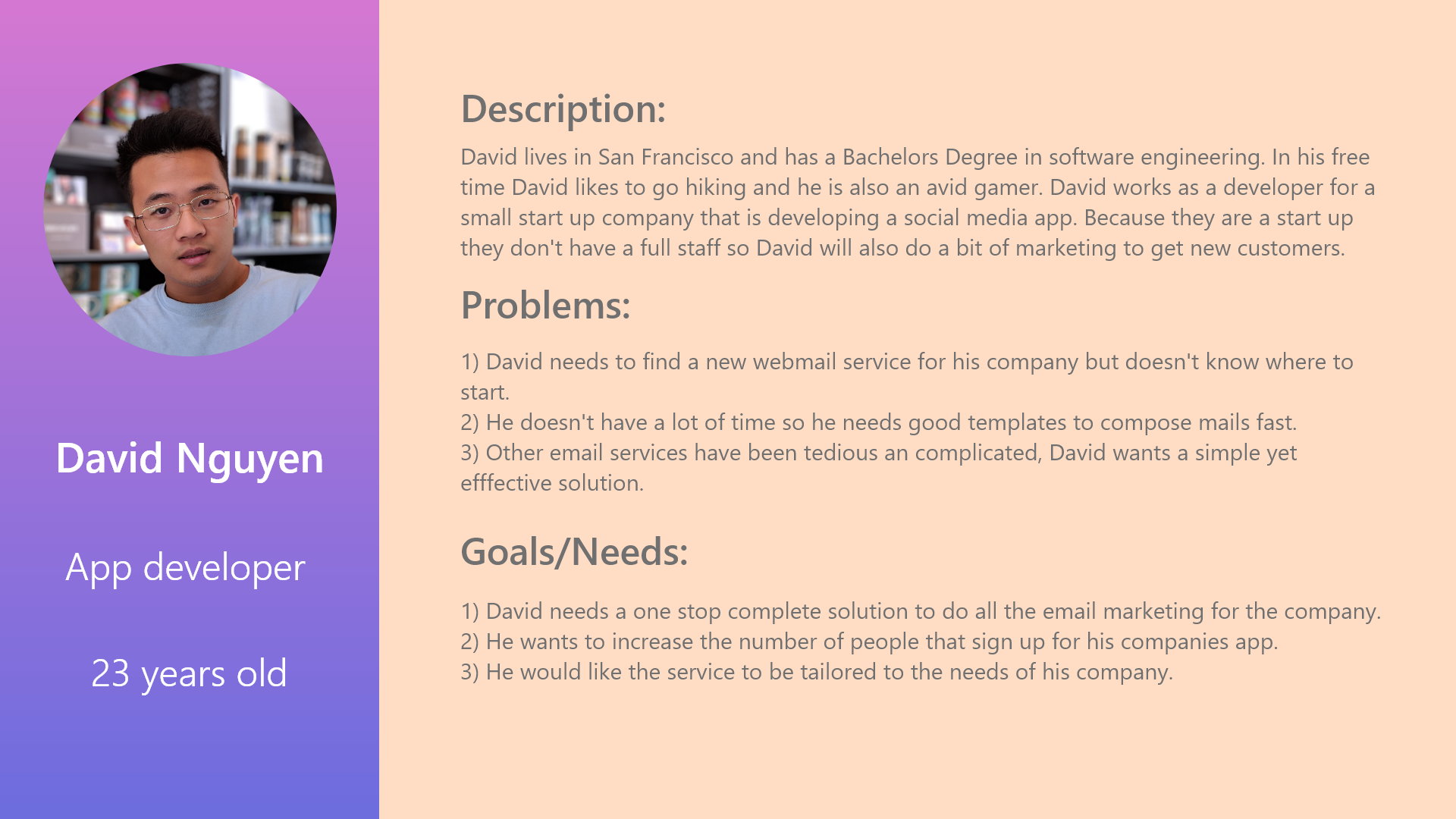
With this information I created two user persona’s, Anna and David. Ann is user that is the owner of small business and will use the Admin role. David works as a developer and will use the basic role.
User persona’s help to identify the users goals and needs. User persona’s help to describe how they use the product, and to understand what is valuable for them.
Admin User
Basic User
Solution
I made a list of assumptions about the goals and needs of the users. I created user persona’s and storyboards based on the user and how they would interact with the product. After that I made a competitor analysis of other email campaign services. With the ideas and insights I gained I started sketching design ideas on which I iterated, made wireframes and a prototype. I did a user test with the prototype and with the learnings of this I created the final mock up.
Lastly I created a presentation about the design process for the stakeholders.
Assumptions
I think users want straightforward and easy to use mailservice.
I think users would like to be able to customize their emails for their target audience.
A lot of users will be visiting the site on their smartphone however I think because most users will visit the site from their office it is likely that they will use a desktop or a laptop.
I think users want a transparent billing plan with no hidden costs. Also I think users would like to have a choice in a plan that best suits their business.
Storyboards
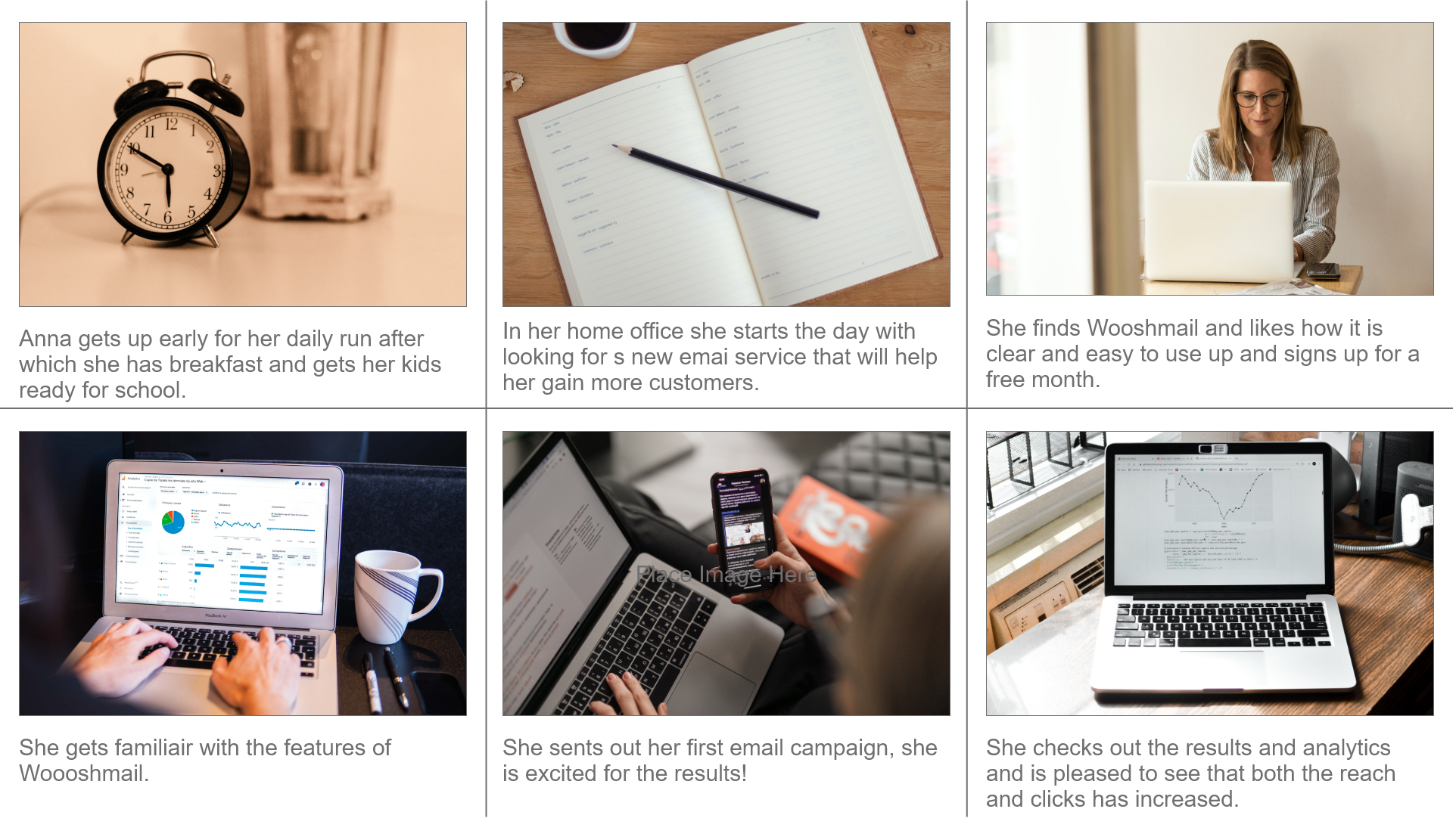
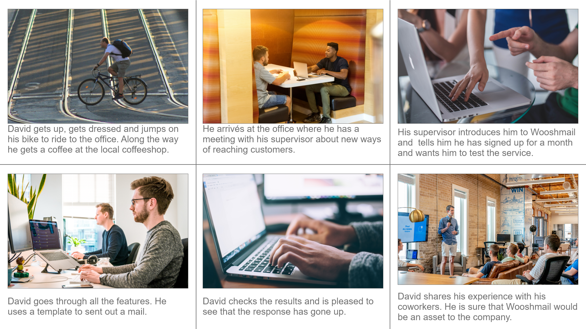
I created two storyboards one for the Admin user and one for the basic user.
The UX storyboard can help visually predict and explore the user experience with a product. It visualizes how people would interact with a service or app.
Admin Storyboard
Basic Storyboard
Competitor Analysis
Now that I had an idea about how the users might experience our product I made a competitor analysis of other B2B email services to determine their strengths and weaknesses.
Mailchimp
Features
MailChimp offers a complete package with a website builder, domain name hosting, landing pages and email marketing. They offer a free plan as well as several paid plans.
Notes
There is a pretty big jump in price between the standard and premium plan going respectively from 14,- to 299,- per month. What I like about mailChimp is their broad offering of services.
Constant Contact
Features
Constant Contact offers not just an email marketing service but a whole package featuring email marketing, Ecommerce, Website builder and social marketing.
They use a drag and drop system for creating emails they also offer ready made templates to use.
Notes
A very useful feature I would like to add to Wooshmail is presenting the results of the email marketing in real time with graphs and bars.
Mailer Lite
Features
Mailer Lite offers a free plan with less features and a premium plan which price increases with the number of contacts.
They have comprehensive reports about the results of the email campaigns but not in realtime like Constant Contact.
Notes
I very much like the offer of a free plan. The HTML editor could also be a useful feature for Wooshmail. Also the feature to send personalized emails is very interesting.
Flodesk
Features
Flodesk markets to businesses in the creative field. The first month of Flodesk is free after that there is a flat rate of $38,- /month for unlimited contacts and mails.
Flodesk can connect to shopify making it easy to import users from shopify into your mailing list. They also have a separate help site with tutorials and best practices.
Notes
I like the dedicated help site. It features lots of useful information and it is even possible to ask the Flodesk staff questions directly. I think this would be a very useful feature for Wooshmail.
One thing I less like is the email editor, although it is easy to work with it does not offer HTML or rich text like mailer lite
Sketches
While sketching I kept in mind that the site should be easy to use and self explanatory with a minimum of guidance. In the first sketches I placed a next button at the right side of every page but I thought it would be better to add an extra navigation bar that doubles as a progress bar so the user knows at what step he is and what will be the next step. I also added a marker to signify the page the user is currently on. To guide the user through the process I also added headers on the pages to signify each function and the order in which the user should go through. I kept it short and to the point so as not to distract the user and complicate the page setup.
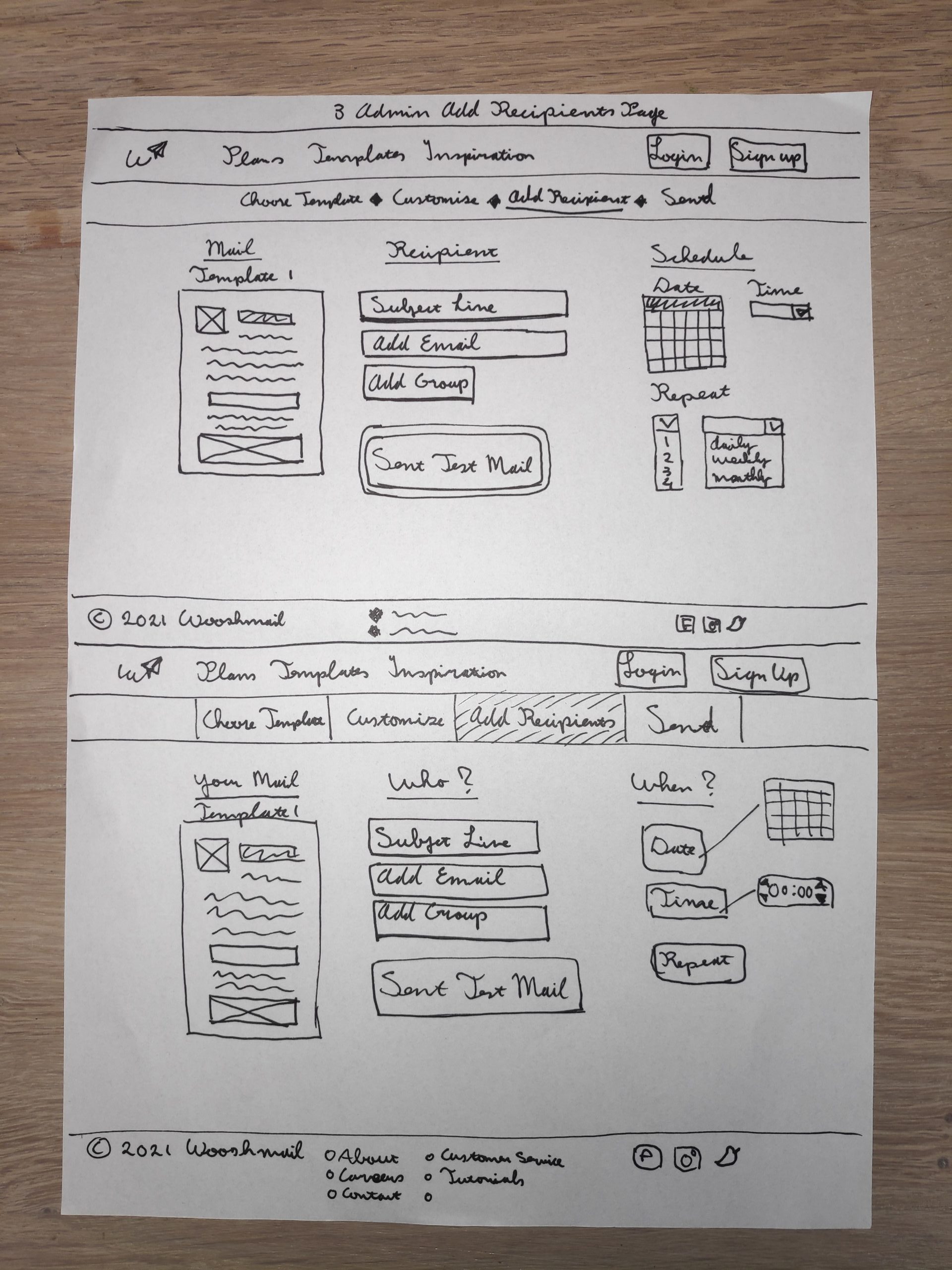
Admin Add Receipients
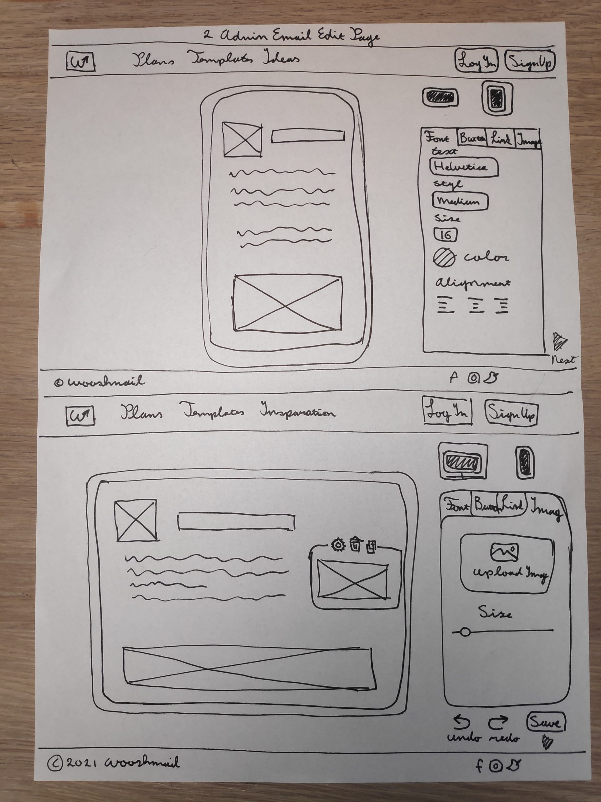
Admin Edit Email Page
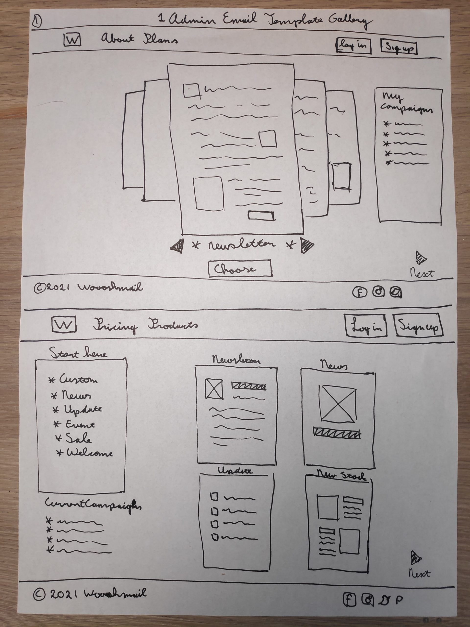
Admin Choose Template Page
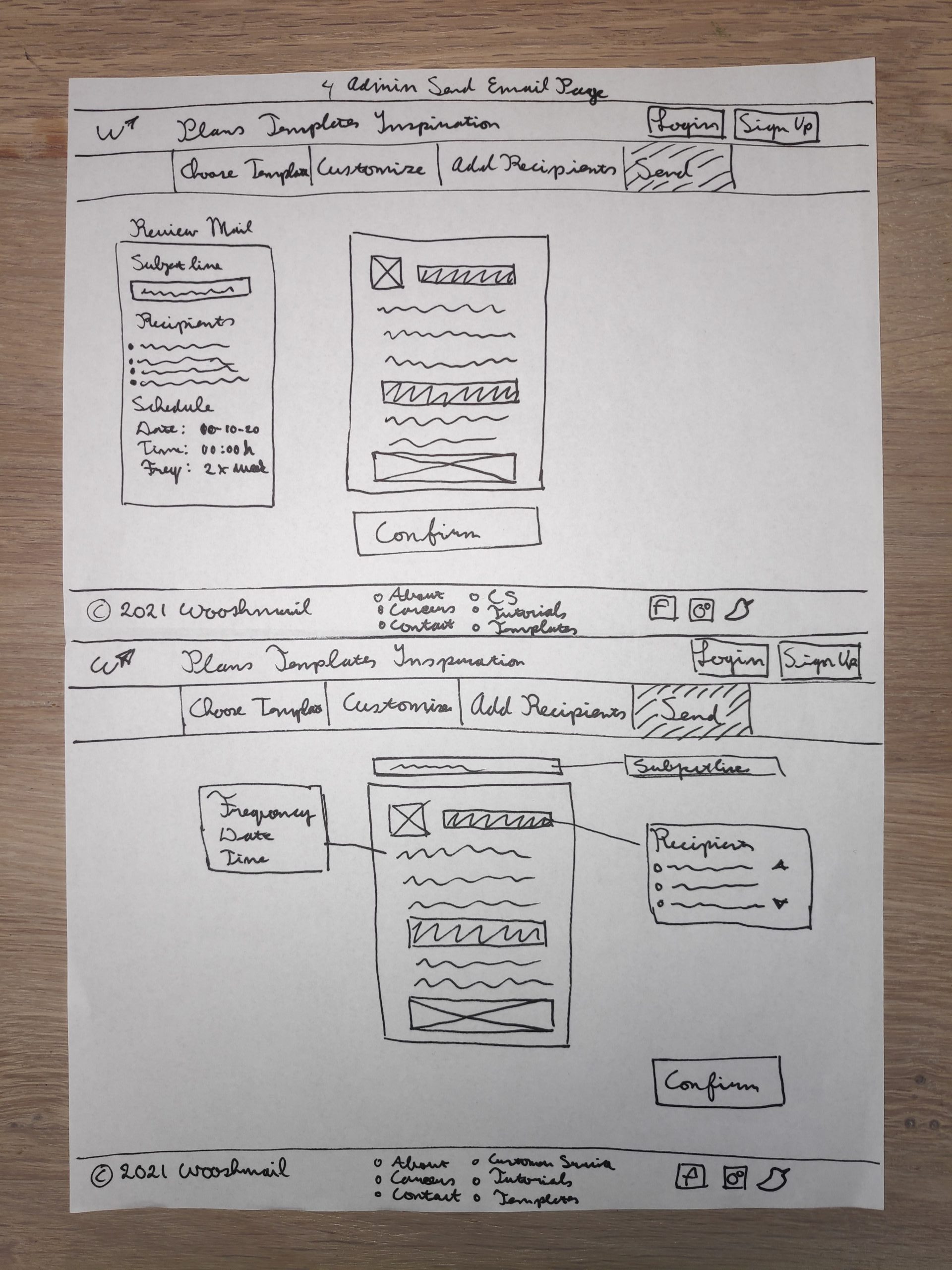
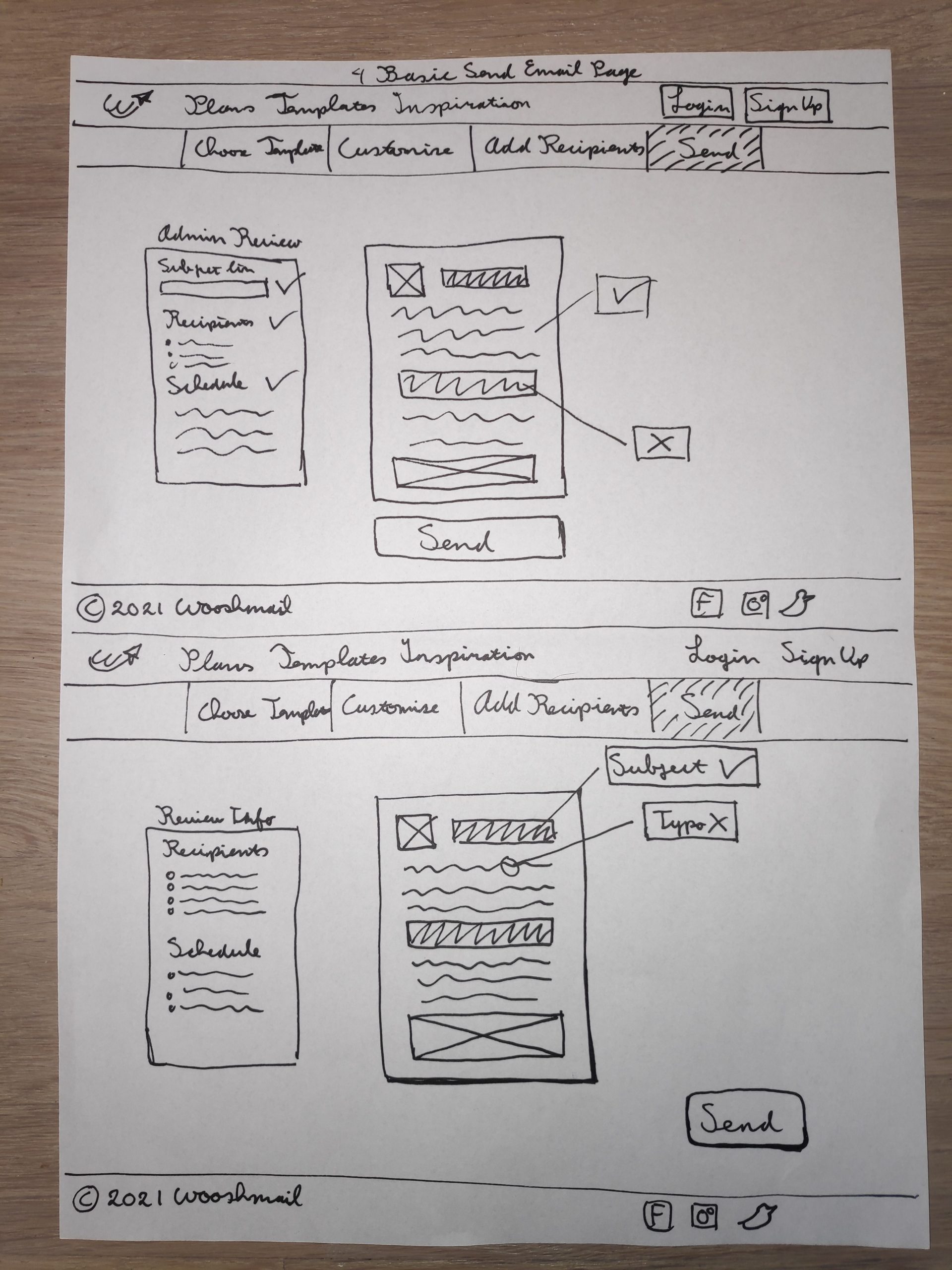
Admin Send Email
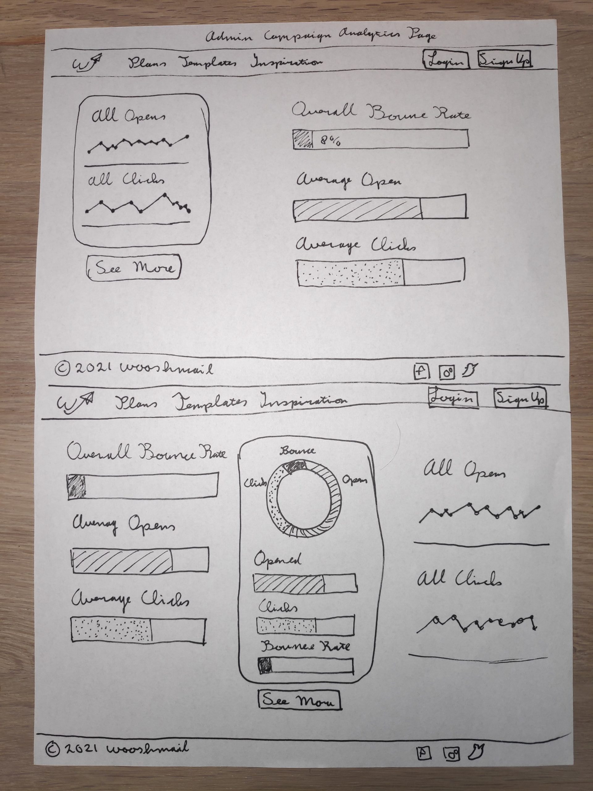
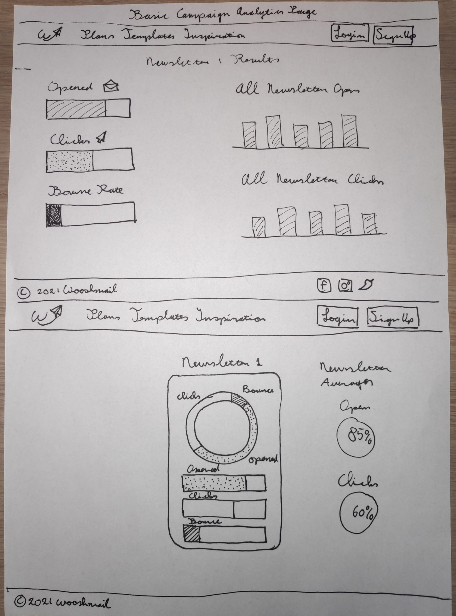
Admin Analytics Page
Basic Choose Template Page
Basic Edit Email
Basic Add Recipients
Basic Send Email Page
Basic Analytics Page
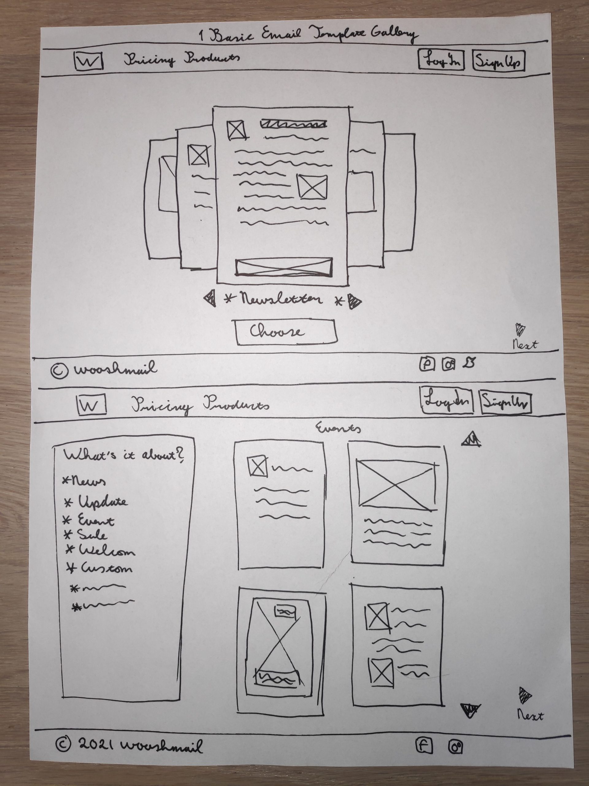
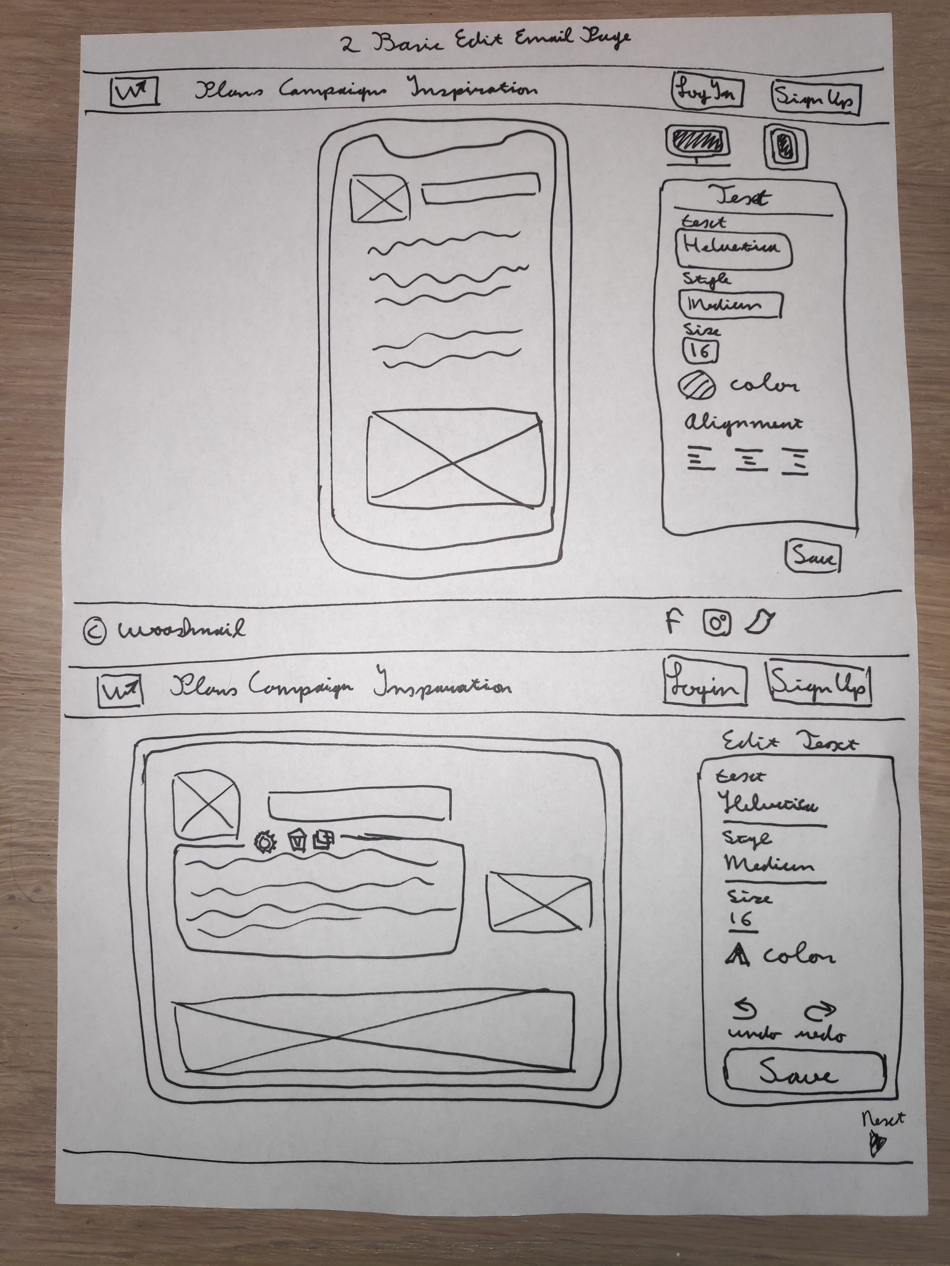
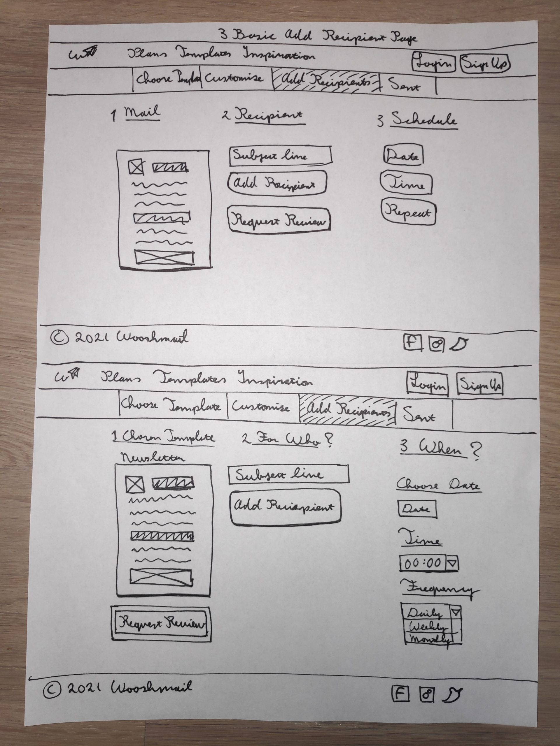
Admin Wireframes
I was pretty happy how my sketches had turned so I did not differ too much from them in the wireframes. However I made some minor tweaks and changes while I designed the wireframes. In the sketches the text and buttons were mostly loose on the page, in the wireframes I placed them in containers to add more structure and clarity. Each container holds a specific function of the page and this will make it easier to convert the page to a mobile site.
Admin Choose Template
Admin Customize Mail
Admin Add Recipients
Admin Send Mail
Admin Campaign
Basic Wireframes
In the Basic Wireframes I added captions on each page to explain the different functions for the user. I also hid some functionalities that are only accessible by the Admin user.
Basic Choose Template
Basic Customize Mail
Basic Add Recipients
Basic Send Mail
Basic Analytics
User Testing
After I had completed the wirframes I built a working protoype for the users to test. I built two versions of the prototype, one for the admin role and one for the basic role. I had one group of five people that fit the audience description to test both roles.
Admin User Testing
What went well?
All users remarked that the layout and presentation was very clear and straightforward.
The progress bar was a feature most users found helpful.
Users liked the presentation of information in the Campaign page.
What needs to change?
Most users could not connect the menu with the templates. It was not clear how to select a template.
Users needed guidance to find the campaign page. the repeat function was not understood by most users.
Users asked why they would need to send the same mail again.
Basic User Testing
What went well?
Overall the users liked the site. The flow was natural and logical.
They liked the campaign page and all remarked that the information presented was clear and easy to understand.
Users liked the captions to help them with choosing a template.
What needs to change?
Basically all the points raised for the admin prototype apply for the basic prototype.
Captions helped a little to explain but for the basic user the ‘Choose Template’ page should be modified to make it easier to understand.
One point was that the ‘See More’ button in the campaign page was not applicable to basic users and it should be removed.
Conclusions
The main issue all users encountered was selecting a template in the Choose Template. Users didn’t understand the link between the menu on the left and the templates on the right. In the redesign we should focus on making this relationship clear. Also use a visual aid to make clear to the user a template is selected.
Also users had trouble finding the Campaign Page apparently the button in the header is not an obvious place for the users. I think it may be a better idea to place the button in a separate container on the template page.
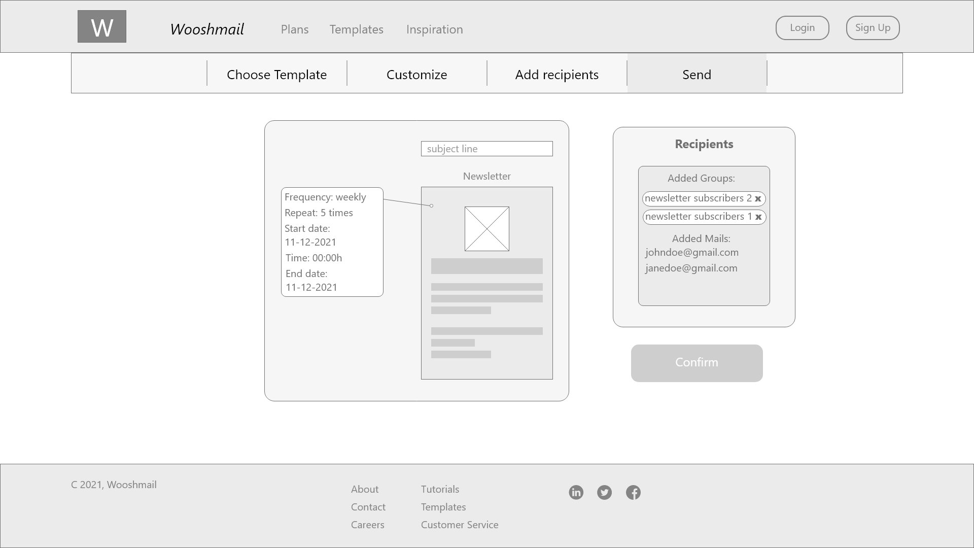
The function of repeat mail should be explained better. Make it clear that the mail can be the start of a campaign, not just a single message. A user suggested adding an end date to the campaign set up. This should also be incorporated in the redesign
In the prototype the progress bar is clickable. I think we should disable this function because users would click on the next page before completing the previous one. I think it would add a button or automatically send the users to the next page when the task is completed.
Mock Ups
User Flow
During user testing of the prototype the following points were raised. -The user flow in the Choose Template section was confusing. -The Campaign page was hard to find for the users.
I removed the progress bar as users were under the impression that it was a clickable navigation menu. To keep users informed of their progress I added a breadcrumbs navigation element. I also added next buttons to the appropriate pages to guide users to the next window.
Overall Visual Design For the visual design I decided on a minimalistic design approach. During the competitor analysis I really liked the minimal design of Flodesk and I want to try to incorporate some design ideas from them in Wooshmail. I used shades of grey for the structure and bright colors for important elements. I used a bright but desaturated color palette.
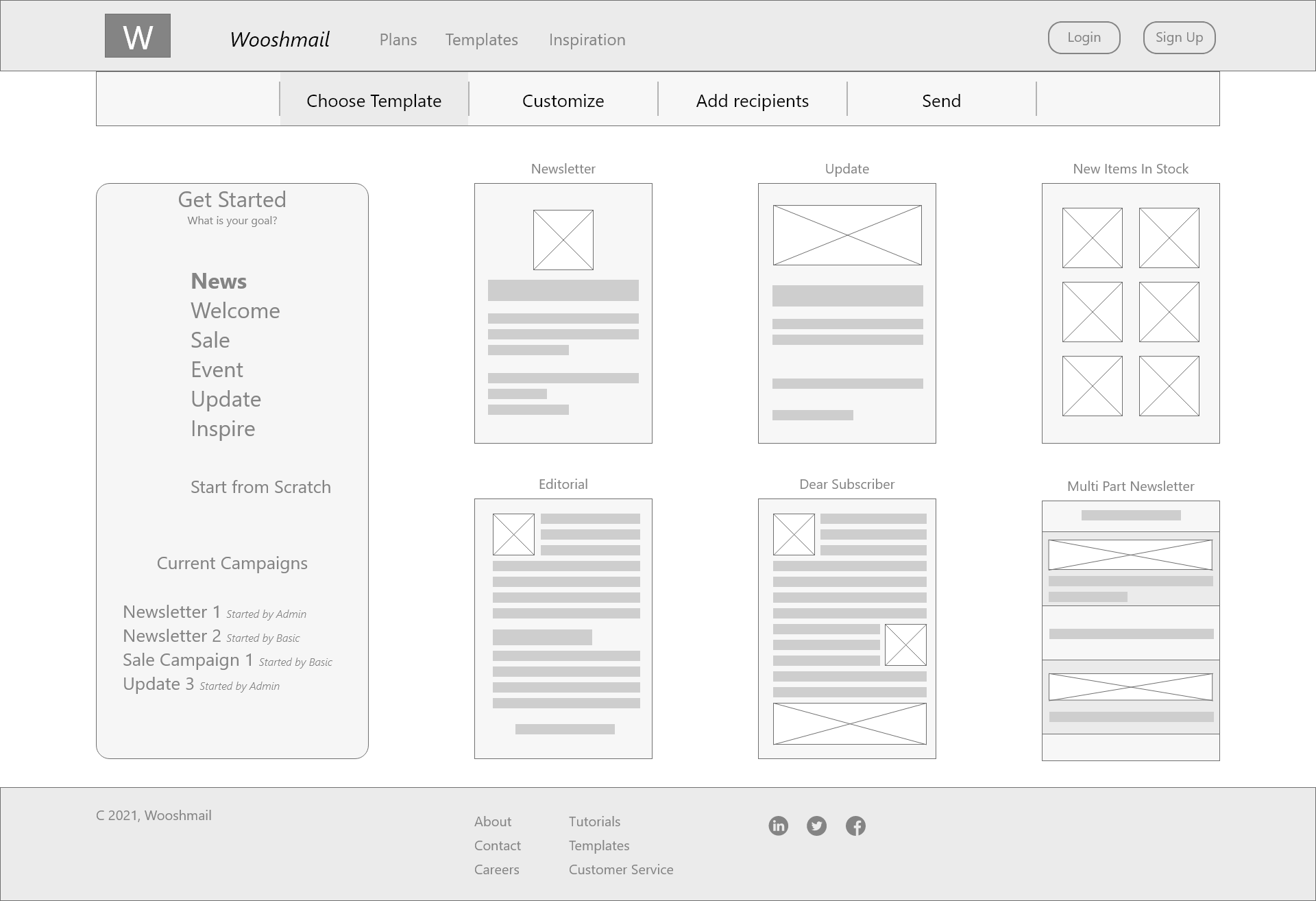
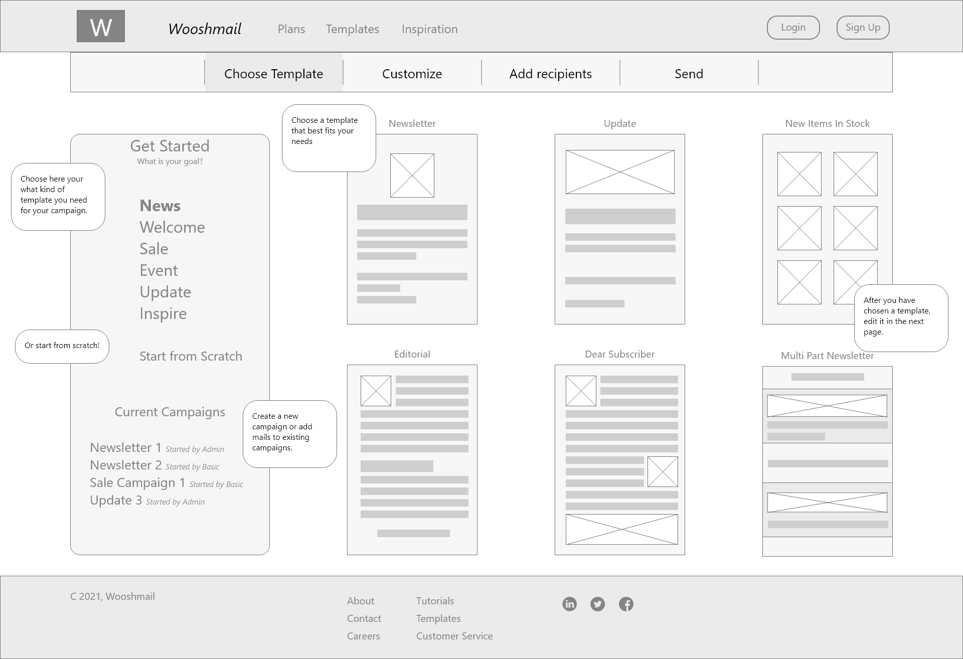
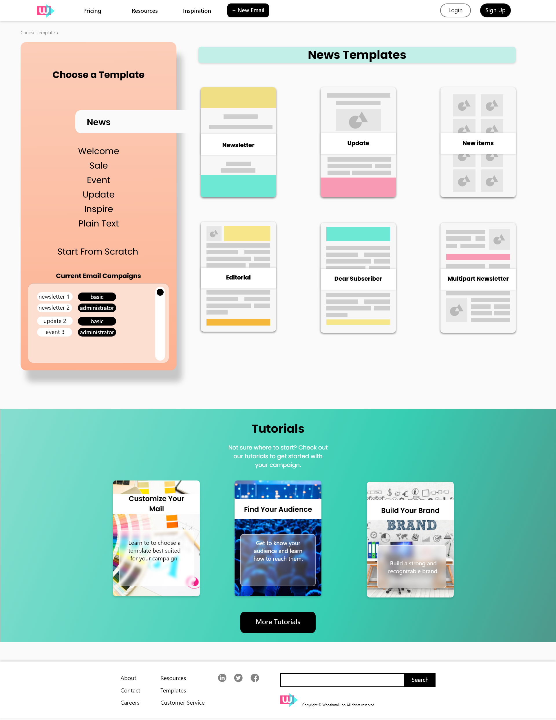
Template Page
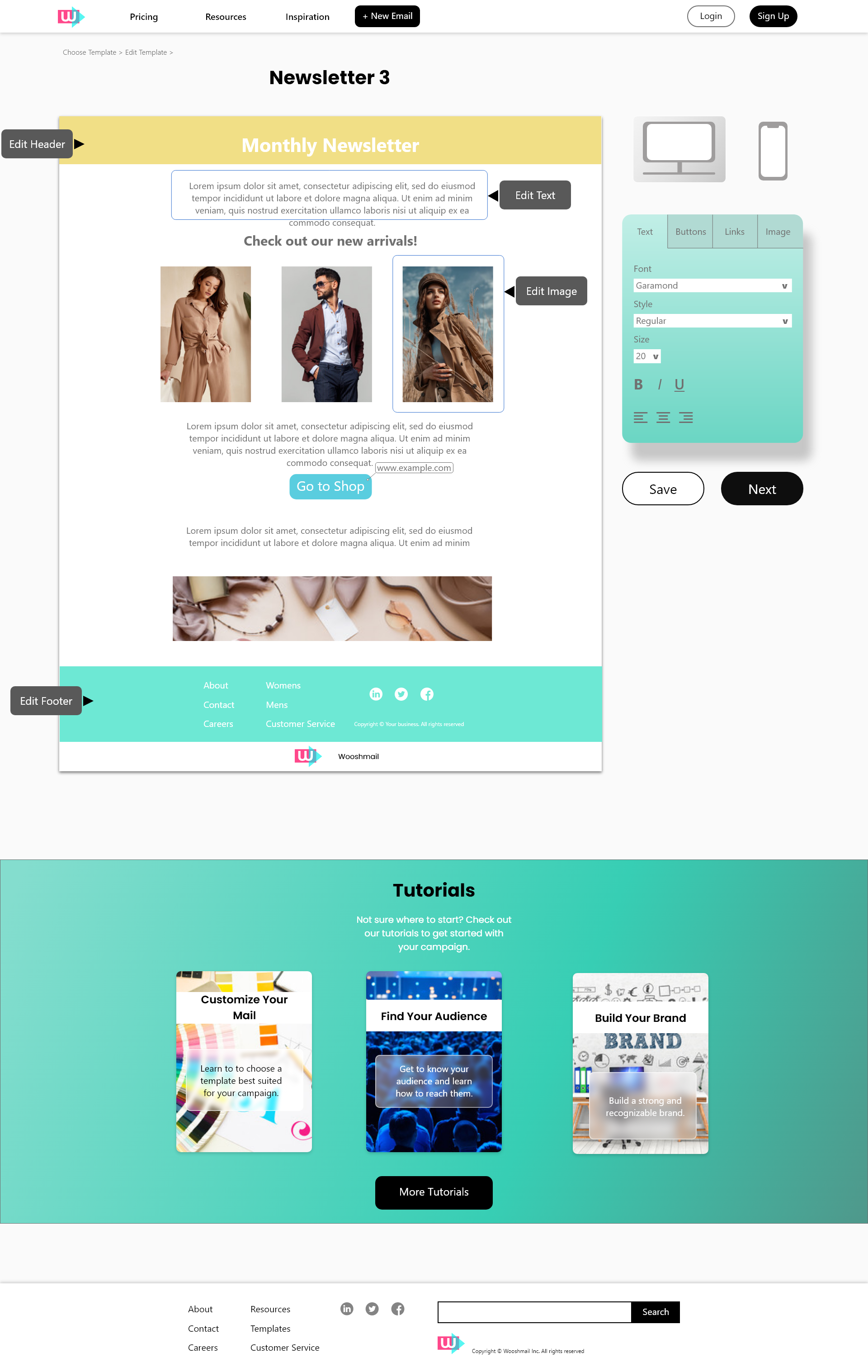
In the template page all users remarked that there was no visual confirmation which template group had been selected. I tried to improve clarity by adding a selector to the chosen menu item that connects with the templates on the right of the page. I also added a header banner signifying the templates.
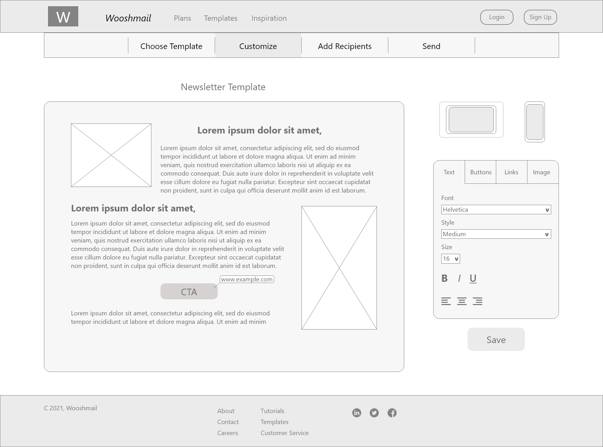
Edit Template Page
In the Edit Template Page I did not change significantly I did however make a few adjustments to the design. I added markers on the template to inform users what elements they can edit. In the first prototype users sometimes did not recognize the selector icons so I enhanced the fidelity making them better recognizable as a desktop and mobile icon.
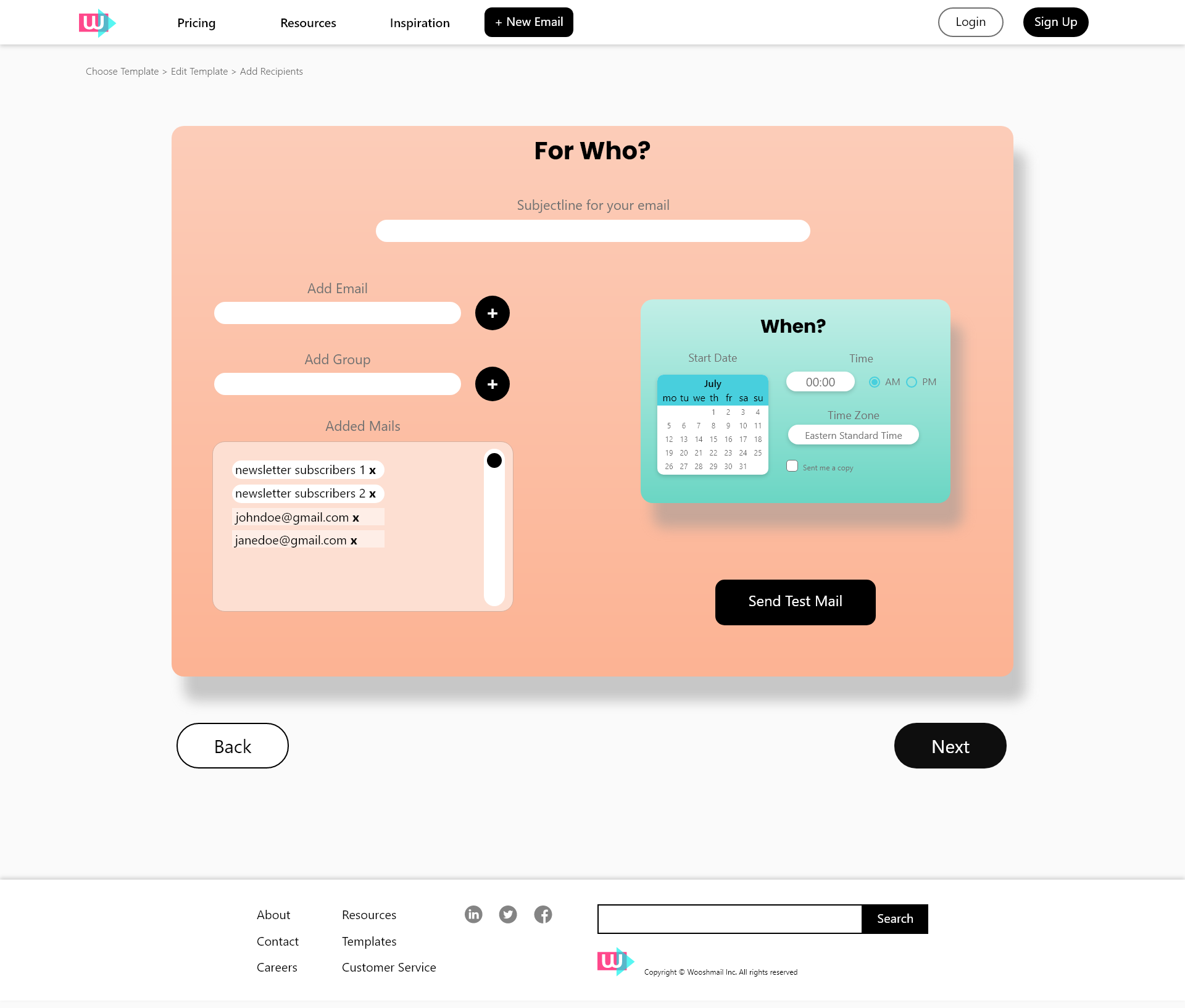
Add Email Page
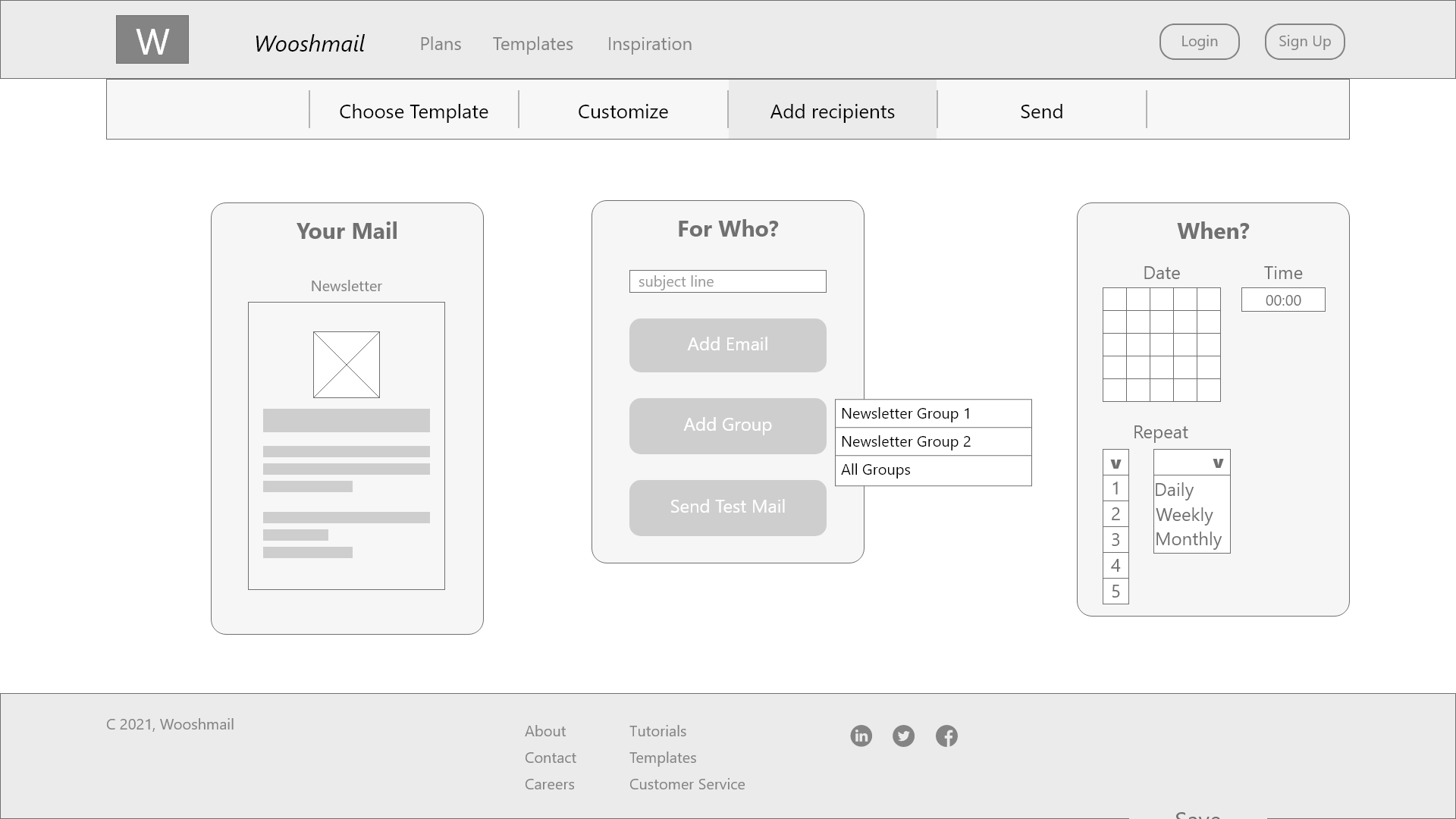
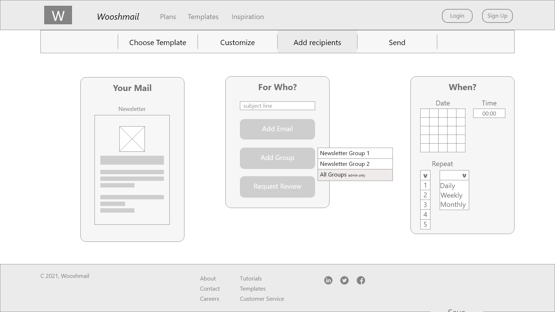
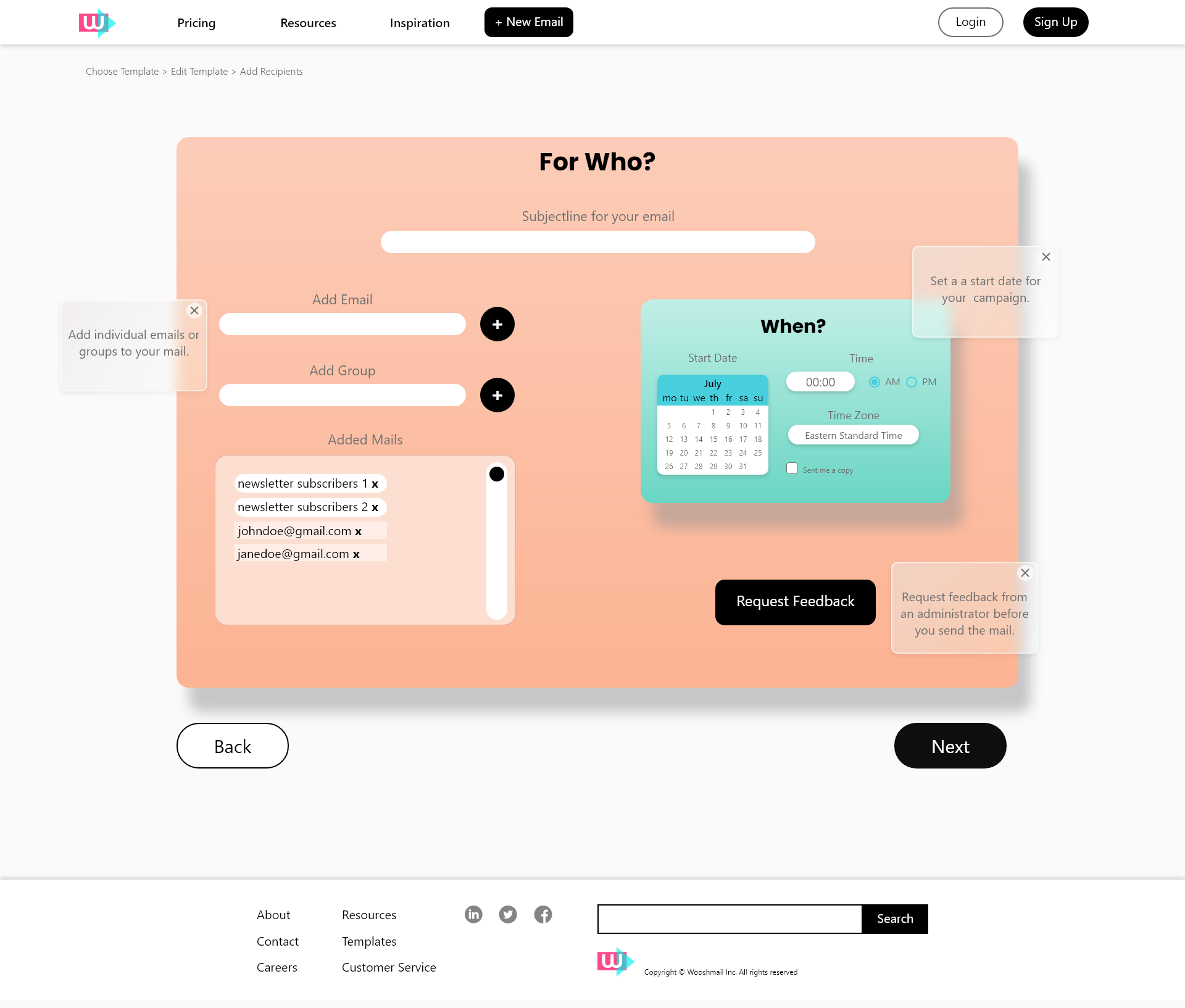
I was not very happy with the initial design of the Add Email Page. Users were confused by the separate windows and not all the functions were clear. Therefore I did a full redesign of the page. I placed all the functionalities into one container. I created a logical flow for the user to follow starting with the subject line followed by the ad email and add groups. I put the starting date and frequency in a separate container to keep it from becoming too cluttered.
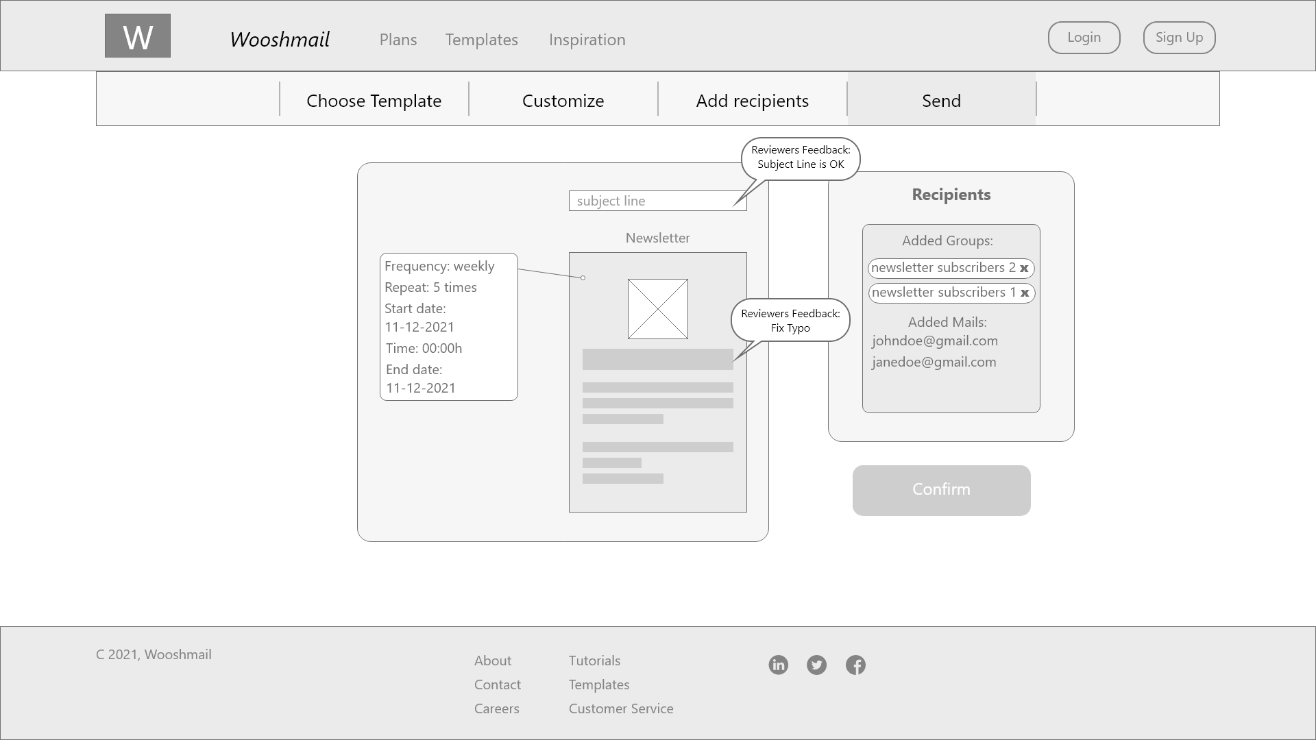
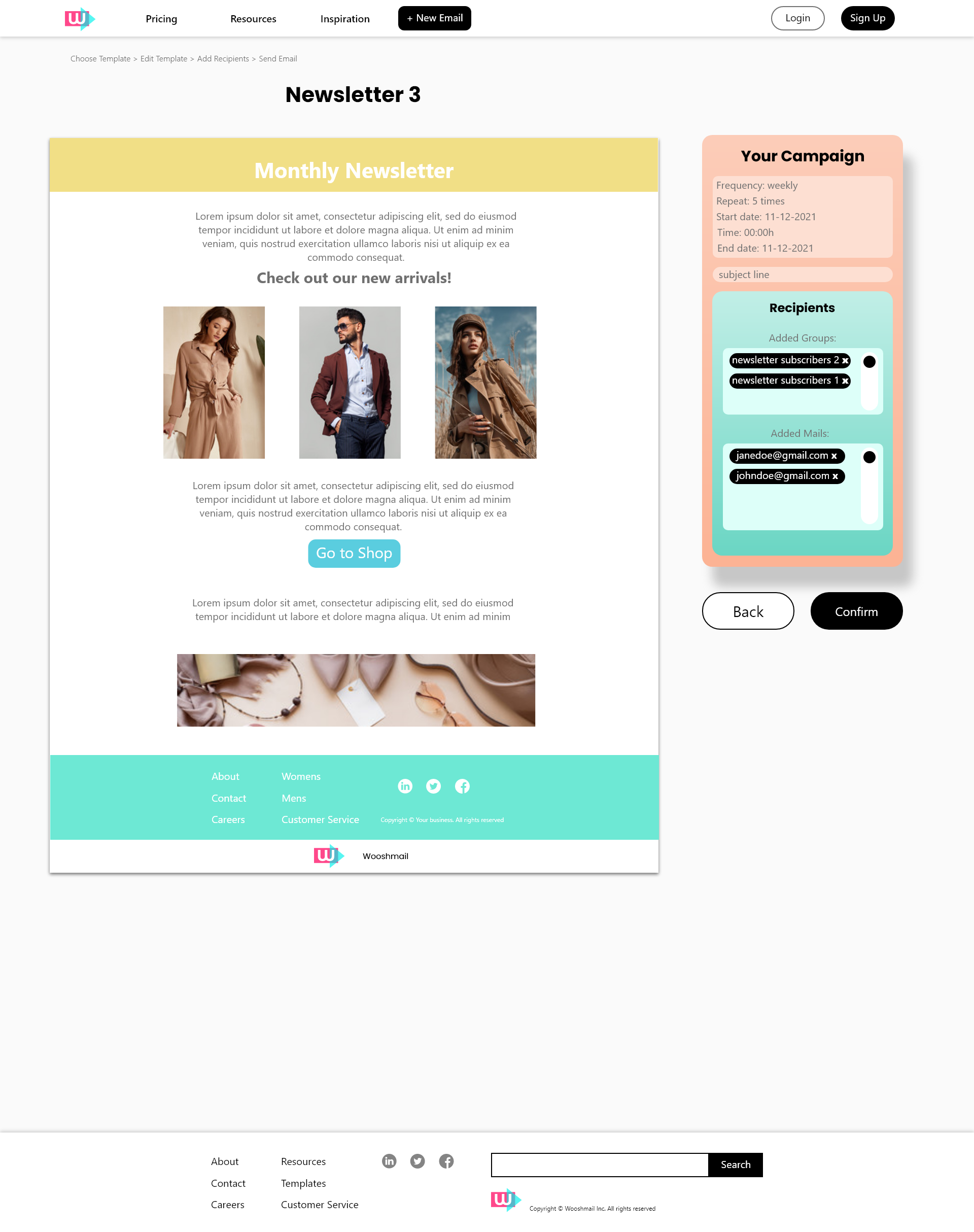
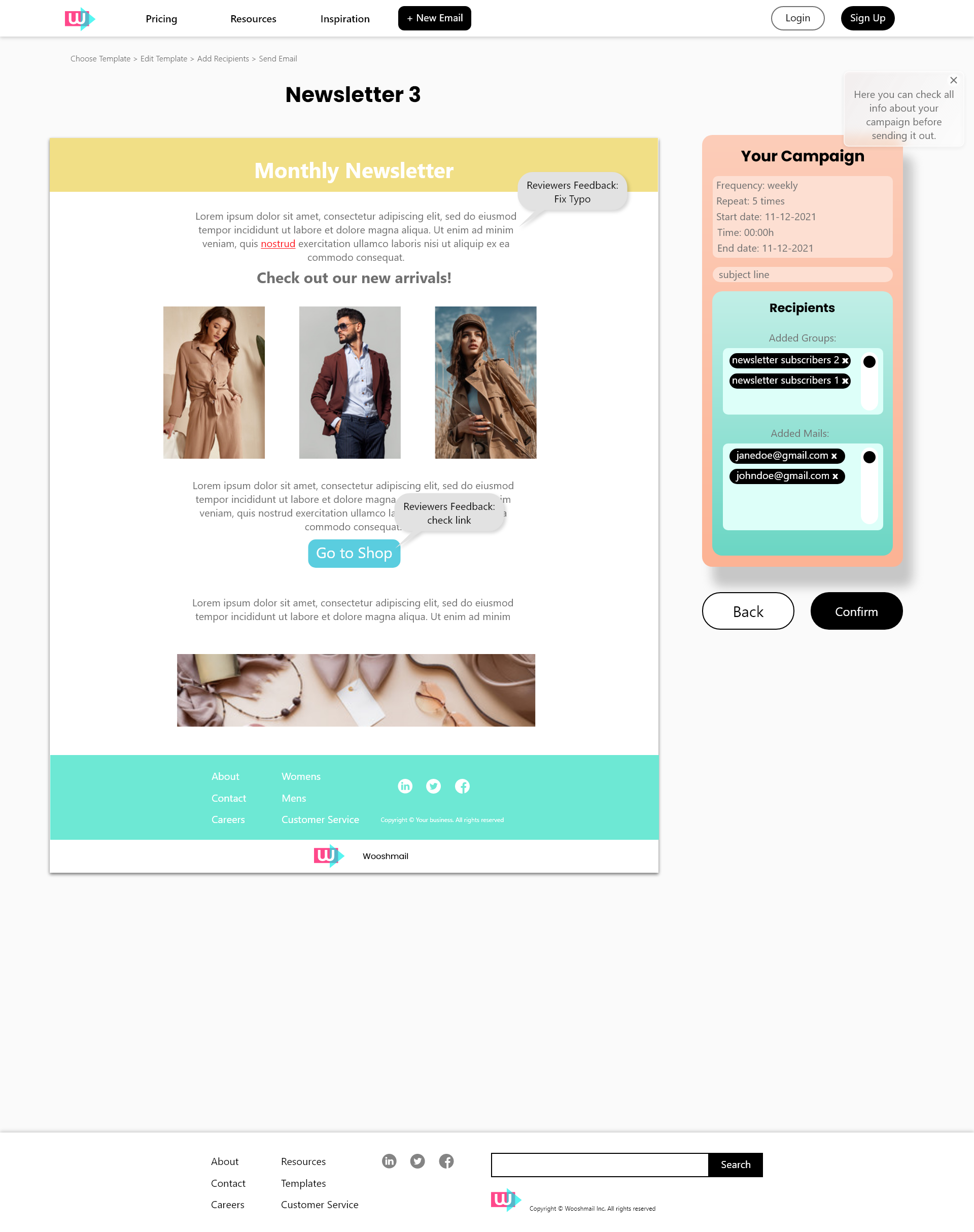
Send Email Page
I did not change a lot in the Send email page, I did however change the layout a bit. Instead of a thumbnail of the mail I chose to show the mail in full view so the user can do a final check before sending the mail.
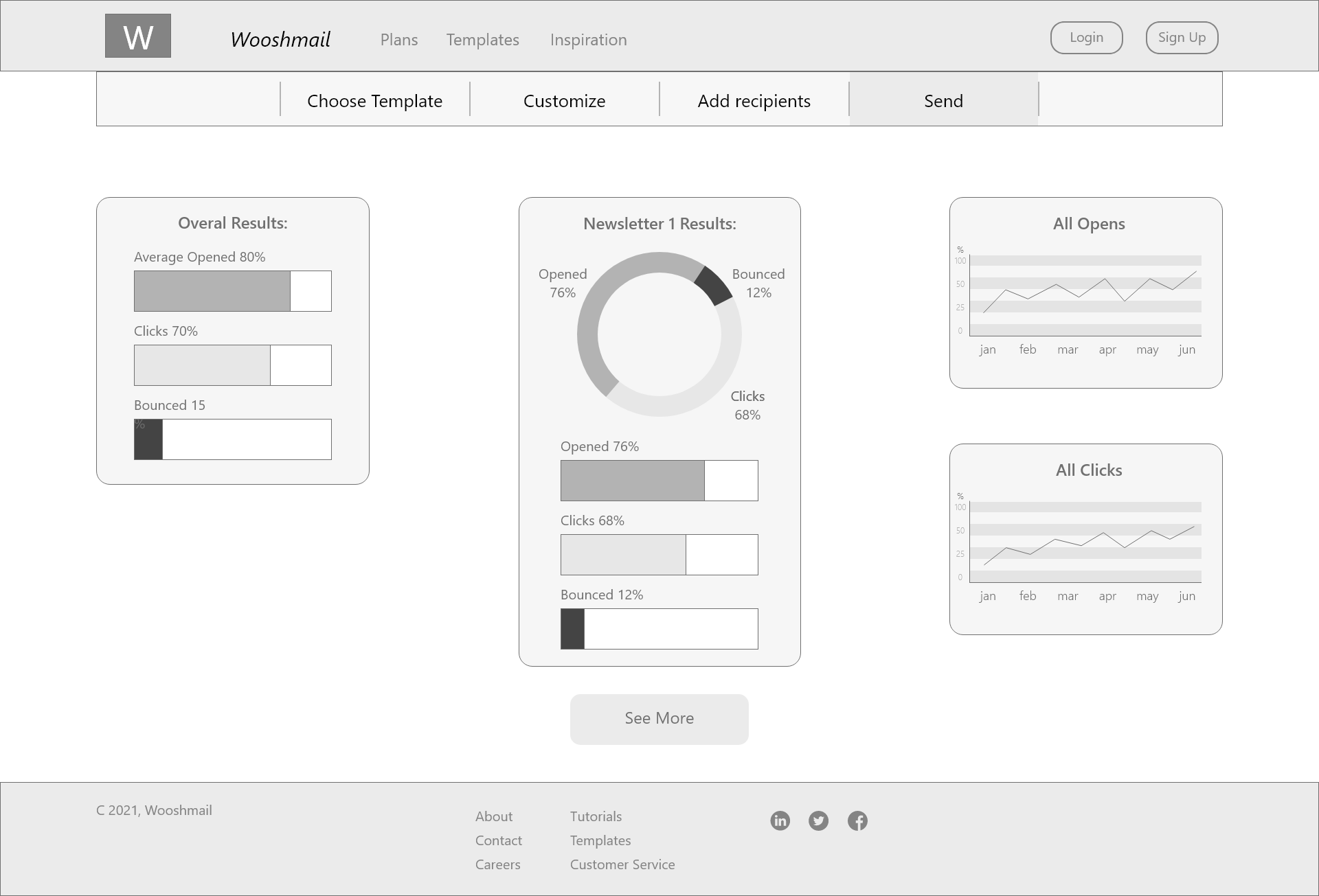
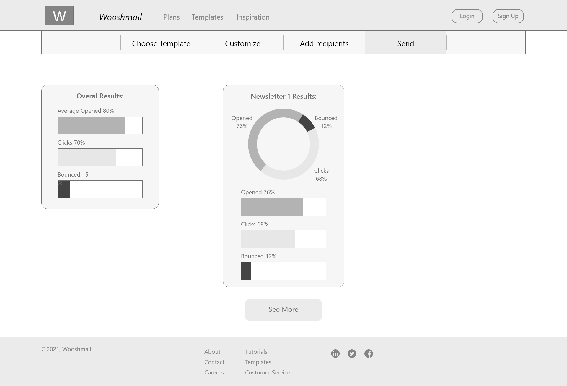
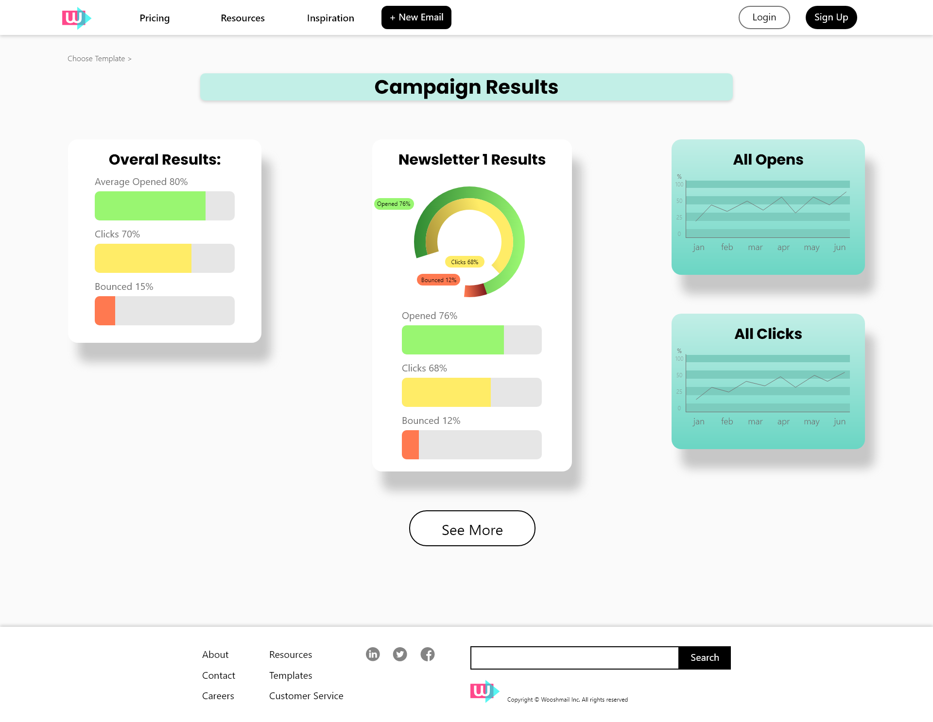
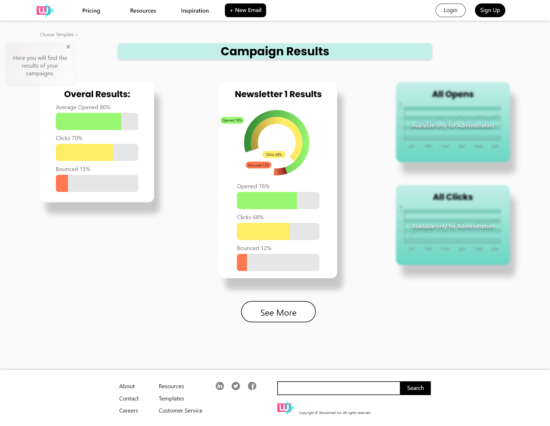
Campaign Page Some users thought the circle diagram was confusing so I separated the bars in the circle diagram and added captions to clarify the meaning.
Admin Choose Template
Admin Customize MaIL
Admin Add Recipients
Admin Send Mail
Admin Analytics
Basic Mock Ups
The Basic User Mockups are the same as the Admin Mockups, however some functionalities are ommitted.
Basic Choose Template
Basic Customize Mail
Basic Add Recipients
Basic Send Mail
Basic Analytics
Presentation
I made a presentation for the stakeholders presenting the design process, analysis and user testing.
Learnings
This was a challenging project. I had no prior knowledge of email services so everything was new to me. I also learned to not to stick with the first solution I came up with to the problems that users encountered during testing. I would think of a solution, iterate on it, and then change it completely after a few days. But I noticed that if I took the time that I would find better solutions to the problems.